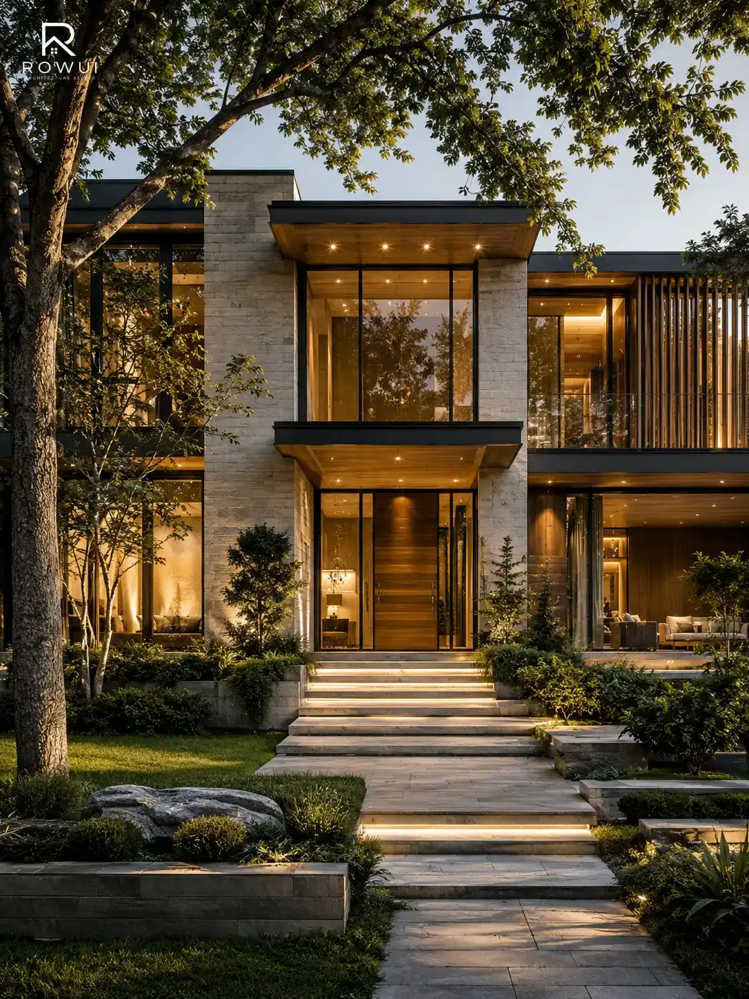
You don't need a full renovation to transform how your home looks from the street. Most of what makes a façade feel forgettable comes down to a handful of fixable mistakes.
There's a particular feeling that stops you on a walk through a neighbourhood, a house that just looks right. The proportions feel balanced, the materials feel considered, the colours feel deliberate. You can't always pinpoint exactly why it works. You just know it does.
And then there's the other kind of house. The one where something feels off. Maybe it's perfectly maintained, freshly painted even, but it still reads as flat, cheap, or unfinished. Homeowners often assume this is about money, that a better looking exterior simply costs more. But in most cases, what separates a house that turns heads from one that fades into the streetscape isn't budget. It's a series of small, interconnected decisions that either work together or undermine each other.
This article is about identifying those decisions and making better ones.
The Problem Is Usually Proportion, Not Finishes
The single most common reason a house exterior looks cheap has nothing to do with the materials used and everything to do with how things are sized relative to each other.
Consider the front door. A standard entry door is 900mm wide and 2100mm tall, and for most homes, that's perfectly fine structurally. But if your door is dwarfed by a large blank façade with no architectural framing around it, it reads as an afterthought rather than an arrival point. Conversely, if you install an oversized feature door in a modest cottage, it creates a tension that feels awkward rather than grand.
The same principle applies to windows. Windows that are too small for their wall openings, particularly when retrofitted without updating the surrounding trim, create a pinched, mean look. The wall dominates, and the openings feel punched in rather than designed. Older homes that have had aluminium sliding windows installed to replace original timber sashes often suffer from exactly this problem. The new windows sit in the same rough opening but without the weight, profile, and reveal depth of the originals, so the façade loses its definition.
What To Do About It
Before making any changes to your exterior, study the proportions of what you already have. Stand across the street and photograph your home. Look at the ratio of solid wall to opening, the size of your door relative to the façade width, and the height of any boundary fencing or garden features relative to the house itself.
Small adjustments such as deepening window reveals with shadow boards, adding a properly proportioned door surround, or simply using appropriately scaled light fittings can shift the reading of your entire façade.
Mismatched Materials Are Telling A Confused Story
A façade is a composition. When it works, every material on it, brick, render, timber, metal, and glass, is in conversation with the others. When it doesn't, each material is speaking a different language, and the result is visual noise.
This is one of the most common problems on homes that have been renovated in stages over the years. The original brick gets partially rendered. The rendered section gets painted in a slightly different white to the trim. A Colorbond fence is added in a colour that clashes with the roofline. A new garage door gets installed in a standard off the shelf finish that doesn't acknowledge anything else on the house. Each decision, made in isolation, introduces a new element to the story until there's no story left, just a collection of materials that happen to share a title boundary.
The issue isn't mixing materials. Some of the most interesting exteriors in residential architecture combine three or four different finishes with great effect. The issue is mixing materials without intention. There's a difference between a home that deliberately pairs raw brick with dark painted timber battens and blackened steel, and a home that has brick on one half, render on the other, and a white PVC garage door running across the bottom of both.
What To Do About It
Identify a maximum of three primary materials for your façade and decide deliberately how they relate. One dominant material, typically the wall surface such as brick, render, or cladding. One secondary material, such as eaves lining, fascia, or window surrounds. One accent, such as a front door, feature cladding panel, or gate.
Each should be chosen in relation to the others, not independently.
The Wrong Shade Of White Is Not A Small Problem
Just paint it white is advice that gets a lot of houses into trouble.
White is not a single colour. There are hundreds of whites in any paint range, and they vary dramatically in undertone. Some read warm and creamy, some cool and blue grey, and some almost purple in certain light. A white that looks clean and crisp on a south facing Victorian terrace in Melbourne can look sickly and flat on a north facing rendered wall in Queensland. A warm white that looks luxurious on a smooth render can look dirty and tired on a rough texture.
The relationship between your wall colour and your trim colour is equally important. One of the most reliable ways to make a house look cheap is to paint the wall and trim the same colour, or to choose two shades of white that are so similar they fail to create any definition but just different enough to look like a mistake.
Beyond white, colour choices in general tend to go wrong when they're chosen from a paint chip in isolation rather than tested against the actual conditions of the home. Natural light, the colour of the roof, the tone of any existing brick or stone, and the surrounding landscape all affect how a colour reads on your façade. A paint chip on a brochure is not a reliable preview.
What To Do About It
Test any exterior paint colour as a large scale sample, at least A3 size, painted directly onto the surface you're treating, and observe it across different times of day.
Choose a trim colour that clearly contrasts with or deliberately complements the wall, not one that simply approximates it. If you're working with render, ask yourself whether the white you've chosen has a warm or cool undertone, and whether that undertone works with your roof, your landscape, and the orientation of your home.
Cheap Or Out Of Scale Fixtures And Fittings
This is the detail that architects notice immediately and homeowners often overlook entirely until they see it in a photograph.
External light fittings, letterboxes, door hardware, house numbers, drainage pipes, and air conditioning units all contribute to the overall reading of your façade. A beautifully painted home with a plastic stick on letterbox from the hardware store and a pair of stainless steel coach lights that belong on a 1990s suburban estate will always read as unfinished, no matter how much was spent on the paintwork.
Light fittings in particular deserve serious attention, because they're the first thing you see at dusk and they significantly affect the character of an entry. An undersized bulkhead fitting on a high ceiling void, or a decorative lantern that's appropriate for a heritage cottage on a contemporary flat roofed home, immediately communicates a mismatch between the building's architecture and the choices made for it.
The same is true of drainage downpipes. Most homes come with standard circular white or grey PVC downpipes, and most homeowners accept them as an unavoidable feature. But square downpipes in a painted out or Colorbond finish that matches the façade read as intentional rather than incidental, a small detail that signals care.
What To Do About It
Audit every fixture on your façade as if you were a stranger looking at it for the first time. Letterbox, lights, door handle, house numbers, downpipes, and gate hardware. Do they feel like they belong to the same design language?
They don't need to match each other exactly, but they should share a coherent character. All contemporary, all traditional, all industrial, or all refined. Replace the ones that don't fit, and choose their replacements as a considered set rather than individually.
The Garage Door Is Running The Show Usually Badly
For the majority of Australian, North American, and suburban homes built in the last forty years, the garage door occupies somewhere between 20 and 40 percent of the total front façade area. That's an enormous proportion of the visual surface of your house, and the standard sectional panel lift door, in its standard colour, with its standard horizontal ribbing, is one of the least architecturally interesting objects in domestic construction.
When a garage door dominates a façade and makes no design contribution to it, the whole house tends to look like an appendage to the garage rather than the other way around. The entry, which should read as the focal point, gets visually overrun.
There are several ways this plays out. The garage is taller than the living areas of the house. The garage door is a different material or colour to everything else. The garage is set forward of the main building line, making it the first thing that reads from the street. Or the door is simply very large, very flat, and very beige.
What To Do About It
If replacing the door is within budget, consider one that speaks the same architectural language as your house. Flush panel aluminium with a dark powder coat finish for a contemporary home, or a timber look panel for something warmer and more traditional.
If replacement isn't possible, painting an existing door to align with the façade colour scheme can significantly reduce its dominance. The goal is for the garage to recede rather than command.
Beyond the door itself, consider whether there are ways to reduce the perceived width or height of the garage opening through landscaping or architectural treatment. A pergola structure running across the front, large planters that interrupt the run of paving, or a screen element that breaks the horizontal can all help.
There's No Sense Of Arrival And No Threshold
A home's entry sequence matters more than most people realise. The moment between the street and your front door is an experience, not just a path, and when that experience is a concrete slab and a flyscreen door, the house reads as unwelcoming regardless of what's on the other side.
The threshold, the transition between public street and private home, is where architecture has the most opportunity to create character. A well designed entry communicates something about who lives there and how they want to be received. That doesn't require a grand portico or a statement door, though both can work wonderfully if they're right for the house. It requires a considered sequence.
This might be as simple as a change in paving material from the footpath to the door. A shift from concrete to timber decking, or from exposed aggregate to pressed concrete pavers, can signal a transition. It might be a pergola or overhead structure that creates a defined passage. It might be a boundary element, a low stone wall, a hedge, or a timber gate, that establishes the edge of the property before you reach the door itself.
Planting plays a critical role here. A path flanked by established plantings, even simple ones, gives a sense of depth and invitation that a bare concrete path simply cannot. Two matching specimen trees on either side of an entry, clipped topiaries in pots, or a single well placed fig or olive tree can completely reframe how a façade is experienced from the street.
What To Do About It
Walk your entry sequence slowly and consider what it communicates at each step. Is there a clear sense of arrival? Is the path direct but interesting? Is there overhead shelter near the door? Is there planting that softens the hard surfaces?
Small interventions such as a new paving surface, a pair of well chosen pots, a fixed pergola, or a shade sail structure can create a threshold where there currently isn't one.
Landscaping That Doesn't Fit The House's Architecture
A house and its garden are a single composition when seen from the street. A beautifully designed contemporary home with a chaotic, unrelated garden doesn't read as well as it should. And a modest, traditional house with a thoughtfully planted and well maintained front garden can look quietly elegant regardless of its architectural pedigree.
The mismatch between house style and garden style is surprisingly common. A formal heritage home surrounded by native grasses and informal mounded planting. A sharp edged contemporary home bordered by cottage roses and a wrought iron picket fence. Neither combination is wrong in principle. Unexpected pairings can work with skill and intention. But when they're arrived at by accident rather than design, the result is incoherence.
Scale matters enormously in landscaping. Shrubs that are too small for the space they're meant to define create a timid, unfinished look. A single hedge that's too low to be meaningful, specimen trees planted too close to the building line so they've been cut back repeatedly and lost their form, or uniform driveway plantings of one species in identical sizes all tend to read as tick box rather than considered.
Paving is often the overlooked landscape element. The expanse of driveway and path that sits between the street and your front door can easily become the most dominant feature of the front garden, which is why its material, colour, and pattern choice matters. Standard grey concrete, poured flat with no break, reads as functional infrastructure. Bluestone, mid grey porcelain pavers, brushed concrete, or even well placed exposed aggregate in a warm tone reads as a design decision.
What To Do About It
Treat your front garden as an extension of your interior design sensibility, with the same level of considered material and planting selection.
Choose plants that relate to the scale of the house, not too small and not overcrowded, and that have an architecture of their own when mature. Clear trunks, defined forms, and deliberate textures can make a significant difference.
Choose paving that complements your façade materials rather than defaulting to whatever the concretor suggests.
The Fence And Boundary Are Being Ignored
Your front boundary treatment is the first architectural element someone encounters when approaching your home, and it's often the most overlooked. Standard Colorbond fencing, chain wire, and aging treated pine paling are all practical solutions to the problem of where your property ends. They're rarely design solutions.
This doesn't mean every home needs an expensive custom fence. It means that whatever forms your boundary should be chosen in relationship to the house rather than in spite of it. A rendered masonry fence with a powder coated gate that picks up the colour of your window frames, or a low timber plinth topped with simple metal posts and horizontal rails, or a clipped hedge that forms a living boundary, each of these makes a design statement that says the boundary is part of the home, not just a legal requirement.
Height is a particularly important consideration for front fences. A fence that's too high creates a fortress reading that closes the house off from the street and often makes a modest home look smaller by comparison. A fence that's too low does nothing for privacy or definition. The right height depends on the house, but in most residential settings, something between 1.2 and 1.5 metres at the front boundary allows privacy and definition without enclosure.
What To Do About It
If your current front fence reads as generic or misaligned with your home's character, evaluate whether it's the material, the height, the colour, or the relationship to the gate that's causing the problem.
Often a paint or powder coat refresh, or the addition of a properly considered gate, can shift the reading significantly without requiring full replacement.
Putting It Together Where To Start
The good news is that transforming the exterior of a house doesn't require starting from scratch, and it rarely requires the scale of investment most homeowners assume. What it requires is looking at your home as a composition rather than a collection of parts.
Begin with the audit. Photograph your home from across the street at different times of day. Print those photographs and look at them the way you'd look at a room you were considering redesigning. What is the strongest element? What is the most distracting? What is missing?
Then work from the large to the small. Sort out the proportions and materials before you address the fixtures and fittings. Get the colour right before you install the new lights. Establish the entry sequence before you choose the letterbox.
The homes that look genuinely well designed are rarely the ones where the most money was spent. They're the ones where every visible element, from the choice of window proportions to the way the garden meets the building, has been considered in relation to everything else. That's not an expensive skill. It's a patient one.
The Takeaway
Your house exterior looks cheap not because it's made of cheap materials, but because the decisions made for it were made in isolation. Fix that by designing the whole rather than replacing the parts, and the result will look like considerably more than the sum of its interventions.
Good exterior design is less about transformation and more about coherence. When everything on your façade belongs to the same considered story, even modest homes feel quietly confident, and that's a quality that no renovation budget alone can buy.