Walk up to almost any modern home built in the last twenty years and pay close attention to what you feel before you even open the door. If the answer is nothing in particular, that is already a problem. The entrance to a home is the single most important architectural moment in the entire building, and yet it is consistently treated as an afterthought. Developers squeeze it down to save square footage. Homeowners ignore it in favour of kitchens and living rooms. Architects sometimes draw it as a formality, a checkbox between the garage and the hallway. The result is a generation of homes that begin badly, that fail to welcome, that offer no sense of arrival, and that quietly undermine everything good happening inside. This article is about understanding exactly what goes wrong and, more importantly, what you can actually do to fix it.
Why the Entrance Matters More Than You Think
There is a concept in architecture called the threshold moment. It refers to the instant of crossing from the outside world into a private space, and good architects treat it with real seriousness. The entrance is not simply a door in a wall. It is a psychological and physical transition that sets the tone for every experience that follows inside the home. When it is handled well, it creates anticipation, safety, identity and belonging. When it is handled badly, as it is in most modern homes, it creates confusion, exposure and a vague sense of disappointment that most people cannot quite name.
Research in environmental psychology consistently shows that first impressions of built spaces are formed within seconds and are remarkably difficult to revise. The proportions of an entry, the quality of light falling through it, the materials underfoot, the sense of shelter overhead and the feeling of being guided rather than dumped all register immediately at an almost subconscious level. Homeowners who invest thoughtfully in the entrance almost always report that it improves not just the look of their home but how they feel returning to it every single day.
The Most Common Mistakes in Modern Entrance Design
The Flush Door Flush with the Wall
One of the most widespread and visually deflating entrance decisions in contemporary housing is placing a front door directly flush with the facade with no recess, no canopy, no porch and no depth whatsoever. The door simply appears as a rectangle in a flat wall. There is no shadow play, no sense of enclosure, no protection from rain while you fumble for keys and no visual weight to anchor the composition of the facade. It looks unfinished because, architecturally speaking, it is.
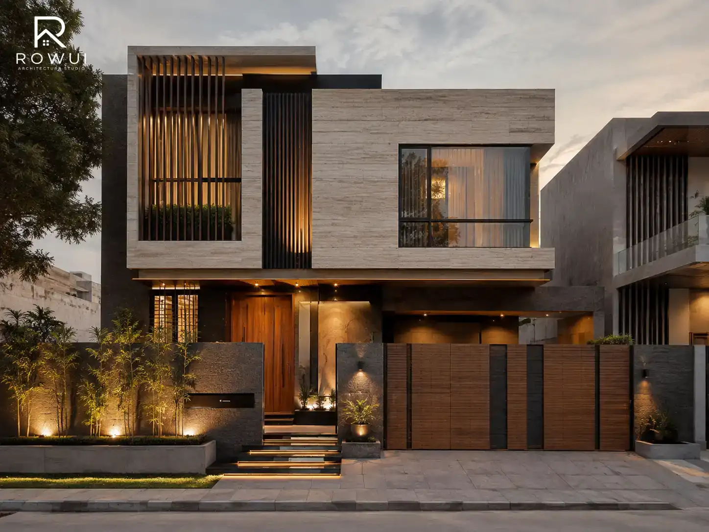
The traditional reason for recessing a doorway was entirely practical. Shelter from weather, definition of the entry point and the creation of a small intermediate zone between outside and inside all served real functional purposes. But that recess also does something visually essential. It creates depth on a facade, and depth creates interest. A door set back even thirty centimetres into the wall casts shadows, frames the entry and immediately gives a home a sense of considered design. Adding a canopy or a small porch roof extends this further. Even a simple flat canopy in powder coated steel or timber can transform the reading of an entrance entirely.
Doors That Are the Wrong Scale
The standard front door in most tract housing and volume built developments measures around two metres tall and about ninety centimetres wide. That is a perfectly serviceable size for a human body to pass through, but it is frequently mismatched with the scale of the house around it. On a two storey home with a tall facade, a standard door reads as pinched and mean. The eye expects the entrance to be a key visual element proportioned to the building it serves, and when the proportions are off, the whole facade looks slightly wrong even to people who cannot explain why.
A door that is generously scaled, perhaps two point two or two point four metres tall with a wider leaf or with sidelights flanking it, immediately elevates the appearance of a home. This does not require spending a fortune. Composite doors, timber doors and aluminium framed doors are all available in taller and wider configurations. Flanking sidelights in obscure glazing add light to the interior hallway while visually widening the entrance composition without compromising privacy. The proportional relationship between door height and ceiling height in the entry hall matters equally. A tall door opening into a low, cramped hallway creates its own awkward mismatch.
The Missing Sense of Arrival
Arrival is not just the act of getting to a door. It is a sequence, a series of spatial and sensory cues that tell you that you are being welcomed into somewhere meaningful. In well designed homes, this sequence begins at the street and unfolds gradually. There is a defined path, a material change underfoot, a planted edge that guides movement, a moment of framing as you approach, a covered zone before the door and finally the door itself.
In most modern homes, there is none of this. A concrete path of uniform width runs from the footpath to the door in a straight line with nothing on either side. There is no narrowing or widening, no overhead element, no gate or marker to signal transition and no planting to soften or frame the approach. You are simply walking across a hard surface to a flat wall. The sense of arrival, which should feel like being welcomed, instead feels like navigating a loading dock.
The fix does not have to be elaborate. A simple pair of columnar plantings either side of the path near the door creates a gateway effect. Changing the paving material from the driveway to the front door, perhaps using textured bluestone pavers or pale sandstone against a concrete drive, signals a transition. A low hedge along one edge of the path creates enclosure and guidance. A timber framed trellis over the last section of path before the door provides overhead definition without requiring a full porch structure. Each of these interventions is modest individually, but together they create a sequence of arrival that fundamentally changes the experience of coming home.
Lighting: The Most Neglected Entrance Element
Lighting at the entrance is almost universally poor in modern homes. The typical approach is a single bulkhead light mounted too high above the door, casting a flat, harsh downward light that illuminates very little of use, creates an institutional feeling and does nothing to make the entrance look welcoming at night. This is a real missed opportunity because the entrance at night is an entirely different architectural moment to the entrance in daylight, and it deserves its own considered response.
Layering Light at the Entry
Good entrance lighting works in layers. The first layer is ambient, providing general illumination across the entry zone so that the path, step and door handle are all clearly visible. The second layer is accent lighting, drawing attention to the architectural features of the entrance such as a textured wall finish, a planted urn or the reveal around the door frame. The third layer is task lighting, a focused point of light positioned at face height near the door so that faces are lit warmly when someone approaches, which also serves the practical function of allowing you to see who is there.
Wall mounted fixtures at approximately one point eight metres in height on either side of the door are almost always more effective than a single overhead fitting. Choose fittings in a finish that relates to the door hardware, whether that is brushed brass, matte black or satin nickel. Path lights set low into planted edges provide gentle ground level illumination that is welcoming rather than interrogating. If the budget allows, a recessed downlight inside a covered entry porch is the most elegant solution, providing focussed light exactly where it is needed without any fixture being visible.
Colour Temperature Matters Enormously
A warm colour temperature of around 2700 to 3000 Kelvin is essential at the entrance. The cool blue white light common in many security or utility fittings makes an entrance feel like a car park rather than a home. Warm light flatters faces, makes timber and stone materials glow richly and creates the sense of being welcomed rather than scanned. If smart lighting controls are being installed, programming the entrance lights to dim to a lower warm level in the evening hours rather than burning at full brightness creates a genuinely inviting atmosphere.
The Entry Hall: Where the Problems Continue Inside
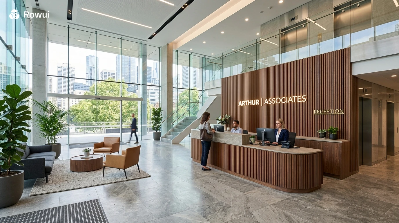
Many homes that manage a reasonable front door then destroy the experience the moment you step inside. The entry hall in modern residential design is a space that developers consistently minimise on the basis that it is not a productive room. It does not contain a bed, a sofa or a kitchen bench, so its area is seen as wasted. The result is hallways that are too narrow to pass another person comfortably, too low to feel dignified and too dark to feel welcoming.
Proportion and Width
An entry hall that is less than one point two metres wide feels like a corridor, which is precisely the wrong feeling for a space meant to welcome. One point five metres begins to feel like a room with purpose. Two metres or more, even for a relatively modest home, creates genuine presence. If the existing hallway is narrow and cannot be widened structurally, the perception of width can be improved considerably through careful use of mirrors, lighter wall colours, vertical rather than horizontal decorative elements and the removal of any storage or furniture that encroaches on the space.
Ceiling Height and Volume
The ceiling height in an entry hall communicates status and generosity more powerfully than almost any other single dimension in a home. A two point four metre ceiling in a hallway feels compressed. Two point seven metres begins to feel considered. Three metres or more, even over a relatively small floor area, creates a sense of occasion that carries through the entire ground floor. Where ceiling height cannot be increased, the illusion of height can be created through vertical wall panelling, picture rails set higher than standard, pendant fittings that draw the eye upward and paint colours that are slightly lighter on the ceiling than on the walls.
The First View from the Door
What you see when a front door opens is a critical compositional decision that most homeowners and many builders never consider deliberately. In the best houses, the first view from the door reveals something beautiful, a framed garden beyond a window at the end of a hall, an artwork on the far wall, a staircase with an elegant balustrade, a pendant light hovering over a console table. This view is a gift to every person who enters, and it also orients the visitor in the space immediately.
In most modern homes, the first view from the door is the back of a coat rack, a hot water cupboard door, the underside of a staircase or a blank plasterboard wall. This is not inevitable. It requires nothing more than considering what someone standing at the open front door will actually see and then making a deliberate decision about what that should be. A simple console table with a mirror above it costs very little and transforms this view entirely. A potted plant on a low plinth, backlit by a recessed ceiling light, creates a moment of composition that takes seconds to set up and rewards every arrival for years.
Material Choices at the Entrance
The materials used at and around the entrance communicate quality, character and care more directly than any other part of the exterior. Because the entrance is the zone of closest human contact with the building, material choices here are scrutinised at the most detailed scale. Texture, colour, joinery quality and the way materials meet each other are all visible at near distance, and they reveal whether the design was considered or rushed.
The Front Door Itself
A solid timber door in a painted or stained finish remains one of the most timeless and visually rich choices available. American oak, Victorian ash and European oak all take paint beautifully and have a warmth and depth that no composite or fibreglass door can fully replicate. That said, good quality composite doors in a well chosen colour can be extremely handsome, particularly in a contemporary home where a painted timber look might feel inconsistent with the overall language. The critical variables are the quality of the panel detailing, the weight of the door when it swings and the quality of the hardware.
Door hardware is disproportionately important. A handle that feels substantial and sits at exactly the right height, a knocker or bell that is appropriately scaled, a letter slot with a solid flap and a deadlock set in a quality escutcheon plate all contribute to the experience of approaching a home. These items are touched every single day and they communicate quality at the most direct and intimate level. Upgrading the hardware on an existing door is one of the most cost effective improvements available to a homeowner.
Paving and Ground Materials
The material underfoot on the approach path and entry step should be chosen to complement the facade materials while providing a clear visual and tactile distinction from the surrounding driveway or garden. Tumbled bluestone pavers in a charcoal tone work beautifully with a dark painted timber door and a rendered white or grey facade. Pale travertine or sandstone pavers suit a more traditional or Mediterranean style home. Porcelain pavers in a large format reading offer a clean contemporary look that pairs well with architectural aluminium doors and glass.
The step up to the front door, where one exists, should be generous in its tread depth, at least three hundred millimetres, and low in its riser height, around one hundred to one hundred and twenty millimetres. A generous step communicates ease and welcome. A steep narrow step communicates the opposite. Where there are multiple steps, stone or concrete with a continuous material rather than individual floating elements reads as more considered and grounded.
The Facade Composition Around the Entrance
The entrance does not exist in isolation. It is part of a facade composition, and the way the door, windows, cladding, roofline and landscape elements are arranged around it determines whether the overall impression is one of coherence and character or of visual noise and randomness. Many modern homes make the mistake of treating the facade as a collection of individual decisions rather than a unified composition, with the result that the entrance gets lost among competing elements rather than serving as the clear focal point.
Symmetry, Asymmetry and Visual Balance
Traditional homes often used symmetry to give the entrance visual authority, placing windows of equal size at equal distances either side of a centred front door. This approach is formal and clearly legible but can feel rigid in a contemporary context. Modern residential design more often uses asymmetric compositions, with the entrance offset to one side and balanced by a larger window or an extended roofline on the other. Both approaches can work beautifully as long as the composition is genuinely considered rather than accidental.
The problem in most volume built homes is that the facade composition is the result of plan requirements rather than any deliberate visual thinking. The door ends up where it ends up because of the room layout behind it, and windows are sized and positioned to meet minimum daylight requirements rather than to compose a coherent exterior. The result is a facade that reads as arbitrary. Even within the constraints of an existing plan, changes to window sizes, the addition of external cladding panels in a contrasting material, the extension of an eave over the entry or the addition of vertical battening to frame the door zone can all bring compositional coherence to a previously muddled facade.
Colour and the Entrance as Focal Point
Colour is one of the most powerful and least expensive tools available to create a strong entrance. A front door in a bold, well chosen colour against a neutral rendered facade immediately establishes the entrance as the focal point of the composition and gives the home a sense of personality and intent. Deep forest green, rich navy, warm terracotta, slate grey and matte black are all colours that work beautifully on front doors without requiring the entire facade to change.
The relationship between door colour, window frame colour and any feature cladding or trim colour determines whether the palette reads as unified or confused. A simple rule is to limit the facade to no more than three distinct colours or tones, with one dominant, one secondary and one accent. The door colour can serve as the accent, provided it is used consistently at the entrance zone rather than appearing randomly across the facade. Even painting the door surround or reveal in a complementary tone to the door itself creates definition and depth.
Landscaping as Part of the Entrance Design
The garden at the entrance is as much a part of the architectural design as the door or the paving, and yet it is almost always treated as a separate afterthought, something to be dealt with after the building is finished and the budget is spent. The result is a strip of lawn, a couple of generic shrubs and perhaps a juvenile tree that will take fifteen years to provide any meaningful scale. In the meantime, the entrance sits in a bare, exposed setting that undermines everything the architecture is attempting to do.
Planting at the entrance should serve three purposes. First, it should provide vertical definition that frames and guides the approach. Columnar trees such as ornamental pears, pencil pines or fastigiate hornbeams are ideal for this because they provide height and structure without occupying a great deal of lateral space on a typical suburban frontage. Second, it should provide seasonal interest, whether that is the spring blossom of a feature tree, the autumn colour of a deciduous shrub or the year round texture of a clipped evergreen hedge. Third, it should connect the architecture to the ground, softening the hard edge between building and earth in a way that feels natural and considered.
A clipped box hedge along the entry path, even at thirty centimetres high, creates a sense of order and formality that transforms a basic concrete path into something with genuine character. A single well chosen specimen tree positioned to cast dappled shade over the entry path in summer provides both practical comfort and visual richness. Planted pots either side of the front door, in a material and scale appropriate to the building, are among the simplest and most effective interventions available to any homeowner regardless of budget.
Practical Improvements You Can Make Right Now
Not every homeowner is in a position to reconfigure their entry hall or add a porch structure to their facade. But there is almost always something meaningful that can be done, and the entry is one of those rare areas of a home where relatively modest interventions produce disproportionately large improvements in the overall experience and appearance of the building.
Start with the door hardware. Replace a tired or builder grade handle set with something of genuine quality in a finish that suits the home. This single change, costing a few hundred dollars, can transform the experience of using the front door every day. Follow it with the lighting. Remove the flat bulkhead fitting and replace it with a pair of properly scaled wall lanterns in a complementary finish. Add a path light or two along the approach. These changes collectively shift the entrance from functional to considered.
Paint the front door in a deliberate colour. This does not require painting the entire facade and can be done in an afternoon. Choose a colour that relates to the interior palette and the surrounding landscape rather than defaulting to the same colour as the window frames. Add two planted pots in a generous scale either side of the door, filled with a simple structural planting like agapanthus, standard lollipop box or a clipped standard rose. Replace or add a quality door mat in a natural fibre. Consider a simple house number plate in a material and typeface that has some considered design rather than a generic plastic stick on numeral.
Each of these steps is available to almost any homeowner at almost any budget level. Taken together, they begin to construct the kind of considered entrance that transforms the experience of arriving home from an unconscious routine into something that genuinely lifts the spirits.
Conclusion
The entrance to your home deserves the same attention and investment you would give to your kitchen or your main bedroom. It is the first thing every visitor sees, the last thing you see when you leave and the moment of daily return that either lifts you or deflates you without you even realising why. Most modern homes get it badly wrong, not through any malicious intent but through a pattern of small decisions made without a clear architectural idea to guide them. The path is an afterthought. The door is whatever came standard. The light is wherever the electrician found it easiest to run a wire. The result is an entrance that functions but does not welcome, that exists but does not belong.
The good news is that this is one of the most correctable problems in residential design. You do not need to demolish walls or engage a structural engineer. You need to look at your entrance with honest eyes, understand what it is currently communicating and then make a series of deliberate, considered decisions about how to improve it. Begin with proportion, light, material and planting. Build from there. The home you return to every evening deserves a front door that means something, and so do you.