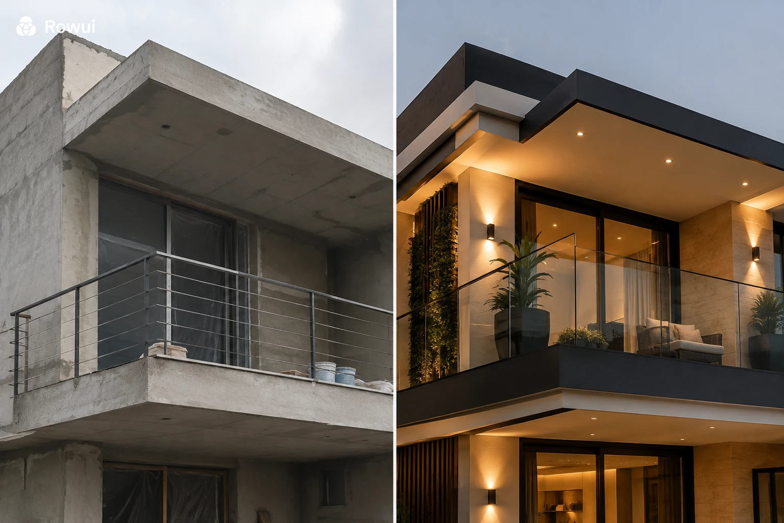
There is something quietly devastating about a balcony that does not quite work. It sits on the front or side of a house, visible to everyone who passes, and instead of adding charm, depth and character to the facade, it makes the whole building look like something is missing. Homeowners spend considerable money and effort designing their interiors, selecting the right paint colours, updating kitchens and bathrooms, and yet the balcony, that small but enormously powerful architectural element, often gets treated as an afterthought. The result is a house that looks unfinished, awkward or cheaply assembled, even when everything else has been done with care. The good news is that balcony design mistakes are almost always correctable, and understanding what goes wrong is the first step toward getting it genuinely right.
Why Balconies Carry So Much Visual Weight
Before diving into specific mistakes, it helps to understand why balconies have such an outsized impact on how a house looks and feels. A balcony is one of the few architectural elements that projects outward from the plane of the building. It creates shadow, depth and a sense of three dimensionality on what might otherwise be a flat facade. When it works well, a balcony gives a house a layered, considered appearance that signals quality and intention. When it fails, it creates visual confusion, breaks the rhythm of the facade and leaves observers with an uncomfortable feeling they may not be able to articulate but absolutely cannot ignore.
Balconies also carry significant human meaning. They represent the threshold between interior life and the outside world. They are spaces for morning coffee, evening air, observing the garden, watching the street. A balcony that is designed poorly does not just look wrong. It also fails as a lived space, which means homeowners stop using it, it falls into neglect, and the problem compounds over time. Understanding both the visual and experiential dimensions of balcony design is essential to getting this element right.
Mistake One: The Wrong Scale and Proportion
Proportion is the single most common cause of a balcony looking unfinished or out of place, and it is also the most invisible problem to untrained eyes. When a balcony is too small for the wall it sits on, it looks like a shelf that was bolted on as a decorative gesture rather than a real architectural element. When it is too large and heavy, it overpowers the facade and makes the house feel top heavy or unbalanced. Getting the proportion right requires looking at the balcony in relation to the entire facade, not just the room it serves.
How to Think About Balcony Width
A balcony should generally relate in width to either the window or door opening it accompanies, or to a clear bay or section of the facade. A balcony that is narrower than the opening it connects to creates a pinched, cramped appearance that makes the whole facade look timid. Ideally, the balcony width either matches the width of the opening with a small overhang on each side, extends to align with structural or decorative columns, or spans a full bay between two architectural divisions of the wall. A width of at least 1.8 metres is generally considered the minimum for a balcony to feel like a usable outdoor room rather than a decorative ledge.
How to Think About Balcony Depth
Depth is where many homeowners make the most consequential compromise, usually for structural or cost reasons. A balcony with a depth of less than 1.2 metres is essentially unusable. You cannot place furniture on it, you cannot stand and lean comfortably against the railing, and it looks more like a window surround than a genuine outdoor space. The minimum depth for real usability is around 1.5 metres, and for a balcony that feels genuinely generous and intentional, 2 metres or more is ideal. When depth is limited, the visual solution is to ensure the railing design, materials and detailing are so refined that the balcony reads as a composed architectural element rather than an inadequate appendage.
The Relationship to Floor Height
The vertical position of the balcony on the facade matters enormously. A balcony that sits too low looks like it belongs to the ground floor even when it is elevated. A balcony positioned too close to the roofline looks precarious and disconnected from the main body of the house. The classical answer to this problem is to align the balcony floor with the floor level of the room it serves, allowing the threshold between inside and outside to feel natural and continuous. This alignment also reinforces the reading of horizontal floor plates across the facade, which gives the building a sense of logical construction and structural honesty.
Mistake Two: Railing Designs That Look Cheap or Confused
If scale and proportion are the bones of balcony design, the railing is the face. It is the most visible element, the one that defines the character and quality of the balcony at a glance. And it is where more mistakes are made than anywhere else. Poorly chosen railings can undermine an otherwise well proportioned balcony completely, while a beautifully resolved railing can elevate even a modestly sized balcony into something that reads as architecturally confident.
The Problem with Generic Metal Tube Railings
The most common railing mistake in residential construction is the use of standard horizontal or vertical metal tube sections with no consideration for how they integrate with the character of the house. These railings are often selected from a manufacturer's catalogue based on price and code compliance, with no thought given to proportion, finish or visual weight. A thin tubular steel railing in a standard silver or black powder coat might be structurally fine, but if the house has traditional detailing, rendered walls, timber accents or a Mediterranean character, that railing will look like it was lifted from a commercial loading dock and attached to someone's home by mistake.
The solution is not necessarily to spend more money, but to think more carefully about what the railing is communicating. A railing with vertical balusters at a refined spacing, a slightly heavier top rail and a clean base detail will always read better than a single horizontal tube system, even if the materials are similar. For traditional or heritage style homes, wrought iron style panels with simple geometric patterns in the spindles create a sense of period authenticity without being theatrical. For contemporary homes, frameless glass panels with minimal stainless fixings give the balcony a floating, transparent quality that enhances the sense of depth and openness.
The Matching Problem
Another railing mistake is using a style that does not match the rest of the house's architectural language. A Victorian terrace with ornate cornices and timber fretwork that has a basic flat bar steel balcony railing creates a jarring collision of visual languages. Similarly, a sleek contemporary home with clean rendered walls and large glazed surfaces that has a fussy, decorative Victorian style railing looks confused and self contradictory. The railing must speak the same design language as the building it sits on, whether that language is traditional, transitional or contemporary.
Glass Railings Done Badly
Glass railings are extremely popular in contemporary residential design because they offer safety without obstruction, allowing views from inside and out and keeping the facade feeling light and open. But glass railings done badly are worse than almost any other option. The most common failures include panels that are too small and create a patchwork grid of visible fixings, glass that has been tinted in an inappropriate colour for the context, framing that is too heavy and defeats the purpose of using glass in the first place, and glass that is left dirty and streaked because no cleaning provision was made at the design stage. If you are using glass railings, the commitment must be total: large format panels, minimal hardware in a consistent finish, and a realistic maintenance plan.
Mistake Three: Materials That Clash with the House
Balconies involve several different material choices: the structural slab or deck surface, the railing system, the soffit beneath the balcony visible from below, the fascia at the front edge, and any columns or support elements. Each of these materials must relate coherently to the palette of the house as a whole, and they must also relate coherently to each other. When materials are chosen independently, without reference to the bigger picture, the result is a balcony that looks assembled rather than designed.
Deck Surface Materials
The deck surface of a balcony is often visible from the street, particularly on raised or prominent balconies. Exposed concrete with no finish treatment looks unfinished and industrial unless the house deliberately embraces a raw concrete aesthetic. Timber decking is warm, natural and visually appealing, but it requires sealing and maintenance and must be appropriate to the climate and orientation of the balcony. Composite decking offers durability and lower maintenance but varies enormously in quality: the cheaper versions look plasticky and artificial in a way that damages the overall appearance of the house. Porcelain tiles in large format, if they extend from an interior floor level out onto the balcony, create a seamless indoor outdoor connection that reads as architecturally sophisticated and is increasingly practical with improved waterproofing systems beneath.
The Soffit Problem
The soffit, which is the underside of the balcony visible when you look up from ground level or from a lower terrace, is one of the most neglected surfaces in residential architecture. A raw concrete soffit with visible formwork marks, stray reinforcing bars or untreated surfaces looks unfinished in a way that undermines the entire facade. At minimum, the soffit should be rendered smooth and painted to match or complement the wall colour of the house. For a more considered result, the soffit can be clad in the same material as the facade, lined with painted timber battens for warmth and texture, or finished in a complementary render colour that creates a subtle shadow plane beneath the balcony structure.
Fascia and Edge Details
The front edge of the balcony slab, known as the fascia, is another detail that reveals whether a balcony has been properly designed or simply built. A thick, blunt concrete edge with no profile treatment looks heavy and crude. A slim, carefully profiled edge suggests refinement and structural confidence. The fascia can be reduced in visual weight by using a shadow gap at the base, by recessing the soffit slightly relative to the face of the fascia, or by cladding the edge in a contrasting or complementary material such as zinc, timber or aluminium. These are small details in absolute terms but they have a significant cumulative effect on how finished and resolved the balcony appears.
Mistake Four: No Thought Given to the View from Inside
Most homeowners think about balconies primarily from the outside, as an element of the facade. But the view from inside the house looking out through the balcony opening is equally important, and it is something you experience every single day. A poorly designed balcony can obstruct light, frame an ugly view, create visual clutter just beyond the glass, or produce an oppressive sense of enclosure rather than the expansive connection to the outdoors that a balcony should provide.
Railing Height and Interior Sightlines
Building codes typically require balcony railings to be between 900mm and 1100mm in height depending on jurisdiction. At the lower end of this range, a railing at seated eye level can obstruct the view from inside when you are sitting down, which is exactly when you most want to look out. A glass railing solves this problem elegantly, maintaining safety while preserving the visual connection. If a solid or semi opaque railing is preferred for privacy or design reasons, consider positioning any solid or opaque elements in the lower portion of the railing height, with a transparent or open section above, so that seated occupants retain a visual connection to the sky and garden while standing passers by cannot see directly into the interior.
The Transition Between Inside and Outside
One of the most powerful opportunities in balcony design is the seamless transition between interior and exterior floor levels. When the interior floor continues uninterrupted out onto the balcony deck, with a floor to ceiling sliding or folding door that disappears into the wall, the room feels dramatically larger and the connection to the outdoors is complete. Achieving this requires careful coordination between the structural slab level, the finished floor level inside, the waterproofing system on the balcony, and the door threshold detail. It is not simple, but it is achievable, and when it is done well, it transforms both the interior room and the balcony experience completely.
Mistake Five: Ignoring the Facade Composition
A balcony does not exist in isolation. It is part of a facade composition, and its position, size, shape and detailing must be considered in relation to every other element on that facade: the windows, the entrance door, the roofline, any projecting bays, the materials and colours of the wall, and the landscape at ground level. When a balcony is added to an existing house, or designed for a new house without this compositional thinking, it can easily disrupt the visual order of the facade and make the house look unresolved.
Asymmetry and Imbalance
A balcony positioned off centre on a symmetrical facade creates instant visual tension. If the facade has a strong central axis marked by an entrance door, a prominent window or a gable, a balcony that sits to one side without a balancing element on the other side will make the house look like something is missing. Either the balcony needs to be centred on the axis, or it needs to be paired with another element of comparable visual weight on the opposite side, or the overall design of the facade needs to be rethought to embrace an asymmetrical composition that makes the off centre balcony feel intentional and dynamic.
The Relationship to Windows and Doors
Balconies typically sit above or alongside windows and doors, and their width, position and structural supports must relate logically to these openings. A balcony that is wider than the window below, with no structural justification visible in the facade treatment, looks arbitrary and illogical. A balcony that aligns precisely with a large window below, or that bridges two windows symmetrically, creates a reading of vertical alignment and structural clarity that feels satisfying and considered. The columns, piers or brackets that support the balcony should also align with the vertical divisions of the facade wherever possible, reinforcing the sense that the building has been composed rather than simply built.
Rooflines and Overhead Elements
The relationship between a balcony and the roofline above it affects both the appearance of the facade and the practical experience of using the balcony. A balcony exposed to full overhead sky is dramatic and open but offers no protection from rain or strong sun. A balcony covered by a generous roof overhang is sheltered and habitable in almost any weather, and the overhang also creates a layered, shadowed quality on the facade that reads as architecturally rich and considered. When no roof overhang is possible, a pergola structure, a frameless glass canopy or a retractable awning can provide shelter while adding another layer of visual interest. The mistake is leaving the balcony with no overhead relationship at all, sitting in the middle of the facade like a platform with nothing above it to anchor it to the building's overall form.
Mistake Six: Poor Waterproofing That Shows
This might seem like a purely technical issue, but waterproofing failures have very visible consequences. Balcony waterproofing that has been poorly detailed or has degraded over time leads to staining on the facade below, efflorescence on the concrete edges, rust streaks from corroding reinforcement, and dark watermarks on the soffit. These signs of water damage are among the most damaging things that can happen to the appearance of a house facade, because they signal neglect and structural problems in a way that is immediately obvious to anyone who looks.
The solution begins at the design and construction stage with proper falls on the balcony surface to ensure drainage, quality waterproofing membranes taken up the wall face and under the door threshold, drainage outlets that are correctly sized and positioned, and edge details that direct water away from the face of the building. For existing balconies showing signs of water damage, a thorough assessment of the waterproofing system followed by remediation, combined with a surface treatment to address any existing staining, will recover much of the visual damage. In some cases, a new deck surface laid over a restored waterproofing system is the most practical and visually satisfying solution.
Mistake Seven: No Outdoor Furniture or an Afterthought of Furniture
A balcony with no furniture looks like a stage set with no actors. It communicates that the space is not really used, which makes it feel like a decorative pretence rather than a genuine living space. Even a small balcony benefits from the presence of at least one chair, a small table and a plant, because these elements establish human scale, suggest occupation and give the facade a sense of life and warmth that no purely architectural detail can replicate on its own.
Furniture Scale and Selection
On smaller balconies, standard outdoor furniture is often too large and bulky, creating visual clutter and making the space feel cramped. The answer is to select furniture that is proportioned for compact spaces: a bistro table with two slender chairs, a narrow bench against the wall, a single lounge chair with a side table. Folding furniture is particularly useful on small balconies because it allows the space to be cleared when not in use and the balcony to read as clean and open from the street. Materials for balcony furniture should complement the palette of the house: powder coated steel in a colour drawn from the railing finish, natural teak or ash timber that echoes the warm tones of a timber facade, woven rattan for a relaxed coastal or garden house character.
Plants and Vertical Greenery
Plants on a balcony do something that no architectural element can do quite as effectively: they soften the hard edges, introduce organic life and colour, and create a connection between the built fabric of the house and the natural world. A well planted balcony with climbing plants on a simple trellis, a row of tall narrow planters along the railing edge, or a collection of terracotta pots in varying sizes creates a facade that looks cared for and alive. The selection of plants should consider wind exposure, sun orientation, and the maintenance commitment of the homeowner, but even relatively low maintenance choices like agapanthus, lavender, ornamental grasses or hardy succulents can transform the appearance of a balcony dramatically.
Mistake Eight: Lighting That Is Absent or Utilitarian
Balcony lighting is almost universally underthought. The standard approach is a single external wall fitting by the door, usually a functional but visually unimpressive fitting chosen from a hardware store range. At night, this creates a pool of harsh light around the door and leaves the rest of the balcony in darkness. From the street, the balcony reads as a dark void in the facade rather than a glowing, inhabitable element that adds warmth and life to the house after dark.
A considered balcony lighting scheme begins with understanding what the lighting needs to achieve: ambience for outdoor dining or relaxation, safety lighting for steps and railing edges, and facade lighting that presents the house beautifully from the street after dark. Recessed soffit lights positioned over the main area of the balcony deck provide even, warm illumination without visible fittings. Strip lighting along the base of the railing or under the top rail creates a floating, atmospheric effect that looks sophisticated and understated. A wall mounted lantern in a style that relates to the character of the house adds a traditional or transitional warmth. Low level bollard lights or step lights at the threshold between inside and outside define the edge of the space safely and elegantly. The colour temperature of all balcony lighting should be warm white, around 2700K to 3000K, which is flattering to both the building materials and to the people who use the space.
Mistake Nine: Treating the Balcony as Separate from the Garden
In houses with gardens, the visual relationship between the balcony and the landscape below is a significant design opportunity that is almost always missed. When you stand on a balcony and look down into a garden, the composition you see matters. A garden that has been designed with awareness of the elevated view creates an experience that is qualitatively different from simply looking down onto an unplanned collection of lawn, paving and plants.
The landscape architect's concept of borrowed landscape, in which the design of a space takes account of views into adjacent areas, applies directly to the balcony and garden relationship. Tall specimen trees planted to frame the view from the balcony, a formal or informal garden layout that creates a satisfying geometric or organic pattern when seen from above, a water feature positioned to be visible and audible from the balcony, or a garden room or seating area below that creates a visual destination: all of these elements enrich the experience of being on the balcony and reinforce the sense that the house and its outdoor spaces have been designed as a whole rather than in fragments.
Mistake Ten: Renovating a Balcony Without Permits or Professional Advice
This is the mistake that has the potential to cause the most serious long term damage, both structurally and financially. Balconies are structural elements subject to specific building code requirements around load bearing capacity, railing height, fixing details and waterproofing. Any significant modification to an existing balcony, including changing the railing system, altering the structure, adding a roof or pergola, or enlarging the deck area, typically requires a building permit and in many cases a structural engineer's input.
Homeowners who carry out balcony work without permits expose themselves to significant risk: insurance complications if something fails, mandatory removal orders from building authorities, difficulty selling the property, and the very real possibility of structural failure. Working with a registered architect or designer who understands local building codes, and engaging a structural engineer for any work that involves modifying the balcony structure, is not an optional extra. It is the foundation on which everything else rests. The good news is that working professionally from the beginning also produces better outcomes: the proportions will be right, the details will be resolved, the materials will be correctly specified, and the balcony will genuinely enhance the house rather than adding to the list of things that make it look unfinished.
Pulling It All Together: What a Well Designed Balcony Actually Looks Like
It is worth taking a moment to describe what happens when all these elements are addressed thoughtfully, because the cumulative effect is far greater than the sum of individual improvements. Imagine a house with a double height facade finished in smooth white render. At first floor level, a balcony spans the full width of a central glazed opening, its floor level aligned with the interior so that the porcelain tiles inside continue uninterrupted through a minimal threshold to the same tiles outside. The balcony has a depth of 2.2 metres, enough for a small dining table and four slender chairs in powder coated steel. The railing is frameless glass with stainless point fixings, allowing a clear view of the garden below and the sky above. The fascia at the front edge of the balcony is slim and clean, clad in zinc that oxidises to a soft silver grey over time. Above, the roof overhang extends 600mm beyond the face of the building, casting the balcony in a broad band of shadow on summer afternoons. Recessed lights in the soffit wash the deck surface with warm, even light after dark. A row of tall, narrow olive trees in white painted concrete planters lines the railing edge. This is not an expensive house in any exceptional sense. It is a well designed house, and the balcony is a central reason why it reads that way.
Conclusion: The Balcony Is Never Just a Balcony
Every element of a house facade contributes to the overall story the building tells about itself and the people who live in it. The balcony, because of its prominence, its three dimensionality and its intimate connection to both interior life and public appearance, carries a particularly concentrated version of that story. A balcony that has been poorly scaled, cheaply railed, badly waterproofed and left unfurnished and unlit tells a story of indifference and incompletion. A balcony that has been carefully proportioned, resolved in its materials, integrated with the facade and the garden, and inhabited with furniture and plants and light tells a story of care, intelligence and genuine pleasure in the act of living well.
The practical takeaway from everything discussed here is simple: treat the balcony not as a structural appendage but as a room. Give it the same design attention you would give to any room in the house, considering its scale, its materials, its connection to adjacent spaces, its light, and the experience of being in it. Consult an architect for the structural and compositional questions. Be patient with the material selections, choosing quality over speed. Invest in the details of the railing, the soffit, the fascia and the threshold. Then furnish it, plant it and light it as if you intend to live in it, because you do. When you do all of this, you will find that the balcony stops being the thing that makes your house look unfinished and becomes instead the thing that makes it look exactly right.