The color of your home's exterior does more than most homeowners realize. It sets the mood before anyone steps inside, signals your design sensibility to the street, and either ties your house beautifully to its surroundings or leaves it looking awkward and out of place. Choosing the right exterior color for a modern home is one of the highest-impact decisions you can make, and yet it remains one of the most misunderstood. People default to safe beiges, follow trends without thinking about context, or pick colors they love on a small paint swatch only to feel underwhelmed when they see them scaled across an entire facade. This guide walks you through how modern homes use color intentionally, what combinations actually work, and how you can make confident, lasting choices that genuinely elevate your home's curb appeal and character.
Why Exterior Color Matters More Than You Think
Color is the first thing the eye processes. Before a visitor notices your front door, your landscaping, or your window detailing, they register the overall tone and palette of your facade. A poorly chosen color can make a well-proportioned house feel flat and dated. The right color, on the other hand, can make an ordinary rectangular volume feel purposeful and sophisticated.
Modern architecture tends to favor restraint. Clean lines, flat or low-pitched roofs, large windows, and honest use of materials are hallmarks of the style. The exterior palette needs to work in harmony with these elements rather than fight against them. That does not mean you are limited to white or gray. It means every color choice should feel deliberate and connected to the overall composition of the house.
There is also the practical dimension. Exterior paint and cladding materials are exposed to UV radiation, moisture, temperature shifts, and environmental pollution. The colors you choose interact with these forces in very real ways, affecting how much heat your home absorbs, how visible dirt and weathering become over time, and how well the finish holds up across seasons.
The Most Popular Modern Exterior Color Families
Modern homes are not confined to a single palette, but certain color families have proven consistently successful in contemporary residential design. Understanding what each brings to a facade helps you make a more informed choice for your own home.
Charcoal, Slate and Deep Gray
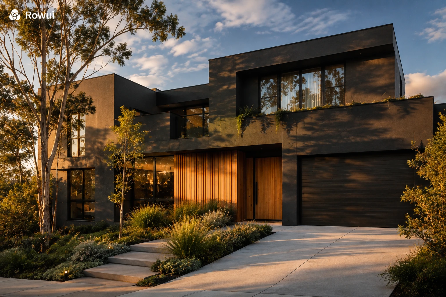
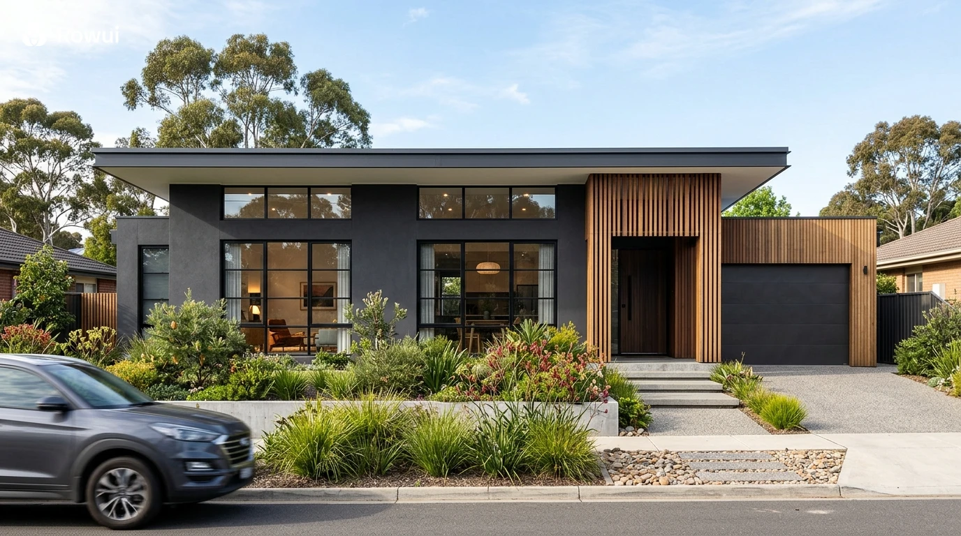
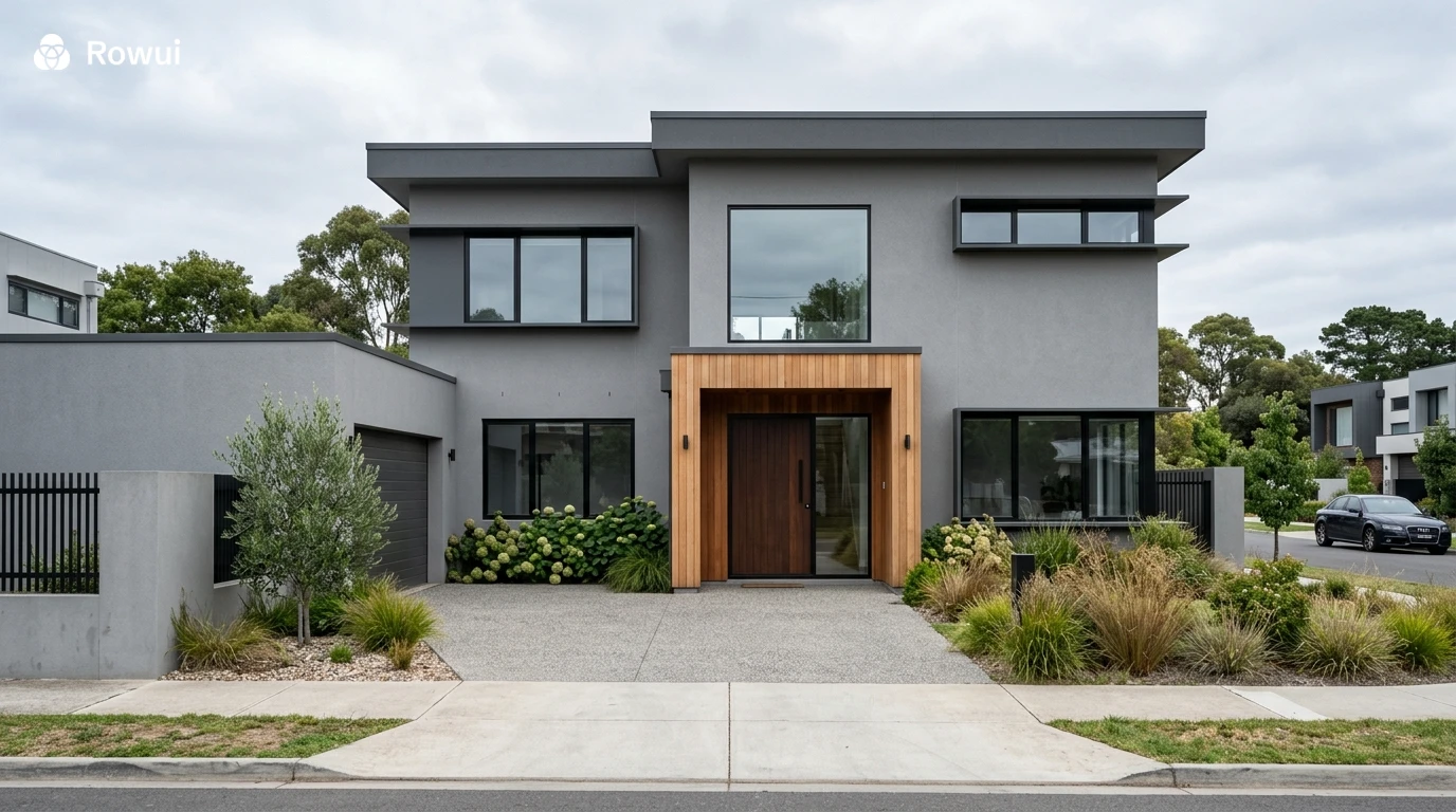
Deep grays remain one of the defining colors of modern residential architecture. A charcoal-rendered facade or dark fiber cement cladding reads as confident and grounded. These tones recede visually, which makes the architectural volumes feel more precise and intentional. When paired with warm timber elements at the entry porch, window frames, or pergola, charcoal avoids feeling cold or industrial. The contrast between dark walls and bright greenery in the garden also creates a striking visual relationship that photographs exceptionally well and looks even better in person.
Shades like Dulux Domino, Resene Nero, and Porter's Paints Charcoal are popular choices. If your home has a flat roof or strong horizontal lines, a deep gray will reinforce that contemporary geometry powerfully. Be mindful on south-facing facades in cooler climates, as very dark colors on masonry walls can absorb solar heat effectively, which can be either a benefit or a liability depending on your location.
Warm White and Off-White
White is perhaps the most enduring color in modernist architecture, and for good reason. A clean, warm white facade creates a sense of brightness and volume that works beautifully across different house forms. The key word here is warm. Pure brilliant white can look harsh under certain light conditions and shows weathering quickly. Off-white tones with a slight yellow, gray, or cream undertone age more gracefully and feel more welcoming.
Render finishes in a warm white work especially well when combined with black steel window frames, dark grout lines in masonry, or natural stone at the base of the building. This combination references the classic modernist palette while feeling fresh and highly livable. Homes with significant glazing benefit from a white or near-white background that reflects light into the interior and creates visual contrast with the landscape beyond the glass.
Earthy Tones: Terracotta, Sand and Warm Ochre
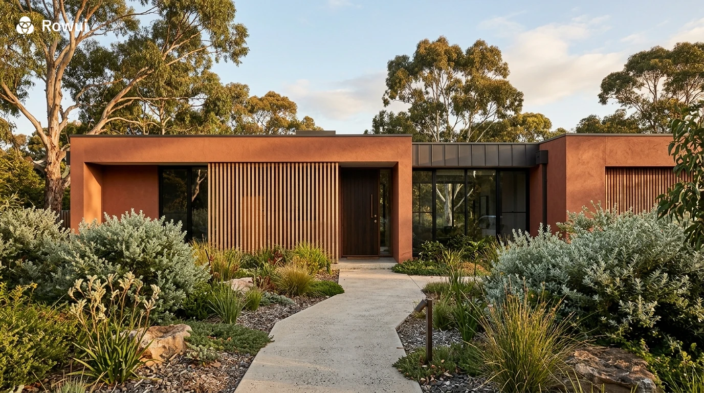
There has been a significant move away from cooler, more industrial palettes toward warmer, earth-derived tones. Terracotta, sandy beige, warm taupe, and soft ochre are finding their way onto contemporary homes in ways that feel rooted in landscape and place rather than purely fashionable. These colors connect a modern house to its natural surroundings, particularly in regions with warm climates, sandy soils, or Mediterranean-influenced landscapes.
A terracotta render on a flat-roofed contemporary home creates a surprisingly harmonious balance between modernist form and natural warmth. Paired with lush planting, timber battens, and bronze or aged brass hardware on the front door, earthy-toned facades have a richness that cooler palettes sometimes lack. They also tend to be forgiving under varying light conditions, looking equally good in bright midday sun and softer late afternoon light.
Black and Near-Black Exteriors
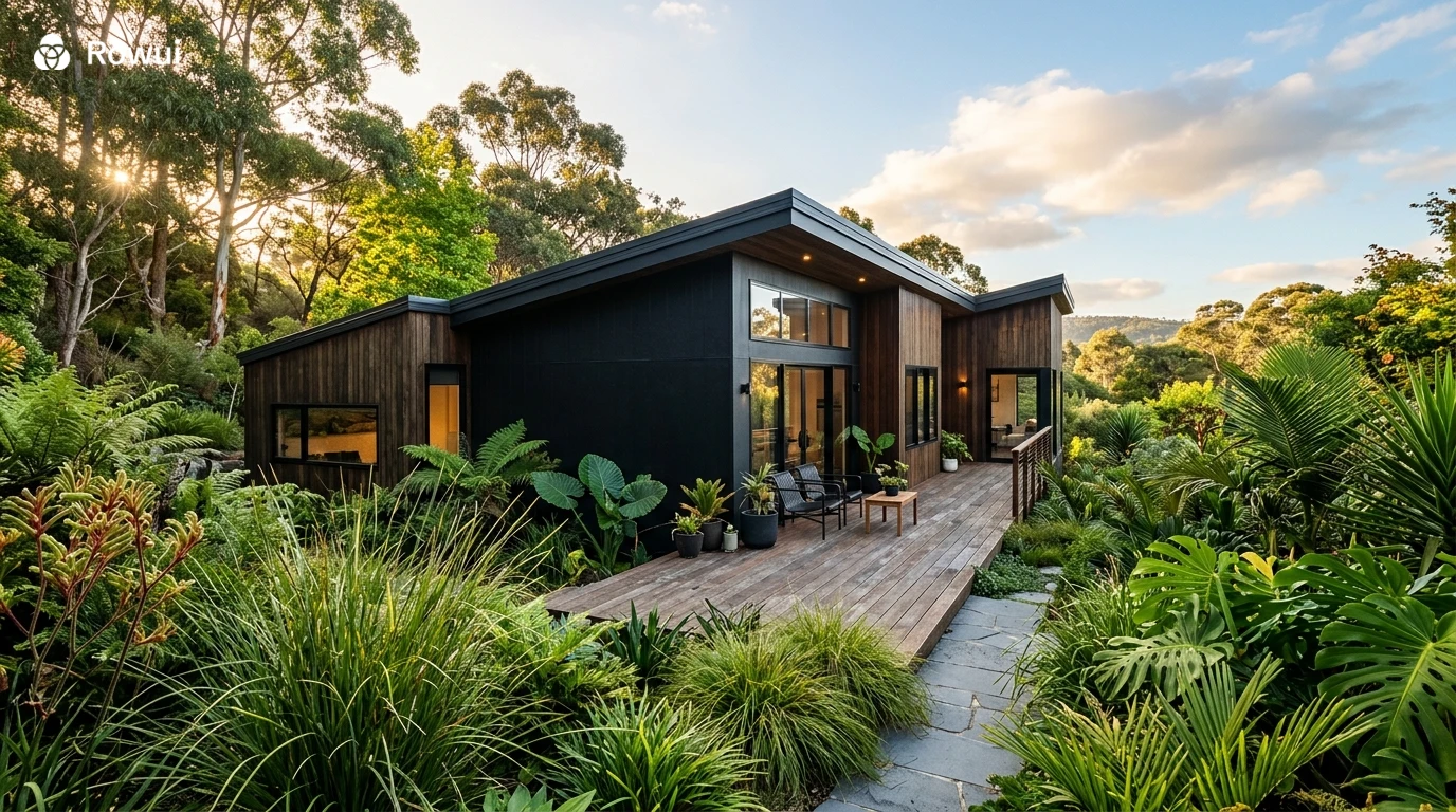
Matte black exteriors are bold, uncompromising, and genuinely impressive when executed well. They demand a strong architectural form to carry the weight of such a decisive color choice. A black house with a simple rectilinear plan, generous eaves, and carefully designed landscaping can be one of the most arresting residential designs you will encounter on a suburban or rural street.
Materials matter enormously here. Black steel cladding, dark-stained timber, matte black render, and black zinc sheeting each create very different textures and light behaviors. Combining two or more of these materials on a single facade adds depth and sophistication that a flat painted surface alone cannot achieve. Black also makes surrounding greenery appear more vivid, which gives the overall composition an almost cinematic quality.
Practical considerations include heat absorption in hot climates and the visibility of dust and pollen on smooth surfaces. Textured black cladding, such as corrugated steel or rough-sawn timber, handles dust far better than a glossy or fine-troweled smooth finish.
Sage Green, Olive and Forest Tones
Green exteriors have moved convincingly into mainstream contemporary design. The appeal is intuitive: green connects a home to its landscape in an immediate and natural way. Sage green, dusty olive, and deeper forest tones all read differently depending on scale and surrounding material choices. A sage green weatherboard cottage has an entirely different character from a deep olive rendered two-storey contemporary home, yet both can be equally successful in their respective contexts.
Green works particularly well in suburban settings with established trees and garden beds, rural and semi-rural properties, and coastal environments where the palette of the landscape already includes muted natural tones. Pair green facades with off-white or warm timber trim rather than pure white, which can feel clinical against organic green tones.
How to Use Two Colors Effectively on a Modern Facade
Most successful modern exteriors use at least two tones, even if they appear to be a single-color composition at first glance. The second color might appear as window frames, a feature entry wall, cladding panels, the underside of a roofline, or the garage door. Getting this combination right is what separates a refined facade from one that feels assembled without intention.
Contrast at the Entry
One of the most effective techniques in modern residential design is using a contrasting color or material at the entry to draw the eye toward the front door and create a sense of arrival. A charcoal or dark toned primary facade with a warm timber or terracotta-colored entry wall behind the door creates a layered composition that feels both welcoming and architecturally deliberate. You are essentially creating a focal point on the facade that guides visitors naturally toward the threshold of the home.
Tone on Tone
Tone-on-tone is a more subtle approach where two shades from the same color family are used across different elements of the facade. A warm gray render paired with a slightly darker gray for the window reveals and a charcoal for the fascia boards creates a monochromatic composition with genuine depth and refinement. This approach works beautifully on homes with strong geometric forms where you want the architecture itself to be the feature rather than the color.
Base and Body Contrast
Some of the most elegant modern facades use a different material or color at the lower portion of the wall, creating a visual base that grounds the building. A dark stone or concrete base transitioning to a lighter render above creates a visual hierarchy that feels both stable and considered. This is a technique borrowed from classical architecture but applied in a thoroughly contemporary way.
Materials, Texture and How They Interact With Color
Color on a modern exterior is never just about paint. The material it is applied to or expressed through fundamentally changes how the color reads, how it weathers, and how it interacts with light throughout the day.
Render
Rendered facades offer a smooth, continuous surface that allows color to register clearly and crisply. Acrylic render can be colored through the mix itself, meaning the color runs through the material rather than sitting only on the surface. This makes it significantly more durable and resistant to fading than a painted surface. Textured render options, from fine sand finish to coarser aggregate, also affect how light plays across the surface and how shadows read across the facade.
Timber Cladding
Timber cladding, whether horizontal weatherboard, vertical batten, or shiplap, brings warmth and natural variation that no painted surface can fully replicate. Stained or oiled timber cladding in charcoal, ebony, or a deep warm brown brings an organic quality to a modern home that paint simply cannot achieve. Burnt timber cladding, traditionally known as Shou Sugi Ban, offers a dramatic matte black or dark charcoal finish with a beautiful surface texture that is naturally resistant to moisture and insects.
Fiber Cement and Composite Panels
Fiber cement panels and composite cladding systems have become extremely popular in modern residential construction because they offer clean, consistent surfaces in a wide range of colors and can be detailed with very tight joints that read as architectural lines across the facade. These materials hold their color well, resist moisture and impact, and allow a level of geometric precision that suits contemporary design strongly.
Brick and Masonry
Brick is experiencing a genuine renaissance in contemporary residential design. White, off-white, charcoal, and blush-toned bricks are being used on modern homes in ways that feel fresh and considered rather than traditional. The texture and joint pattern of brickwork adds visual richness that render or cladding cannot match, and the inherent color variation within even a single batch of bricks gives a facade a liveness and depth that only improves with age.
Choosing Colors That Work With Your Roof and Landscape
No exterior color exists in isolation. It is always seen in relationship to the roof, the driveway, the garden, neighboring properties, and the quality of light in your specific location. These relationships need to be considered carefully before committing to a palette.
A dark charcoal roof pairs comfortably with a wide range of wall colors, from white to sage green to warm terracotta, because its neutrality creates space for the wall color to do the expressive work. A terracotta or dark red roof tile, on the other hand, sets a warm undertone that limits the wall palette to colors that harmonize with those warm hues. Cooler grays and blues will feel disconnected under a warm roof color.
Landscaping plays a similarly important role. Dense, dark green planting against a white or light-colored facade creates a crisp contrast that emphasizes the architecture. The same planting against a deep green facade creates a more immersive, camouflaged quality where the house feels like it emerges from the garden rather than sitting apart from it. Neither is wrong, they simply create very different experiences.
The Role of Windows, Doors and Hardware in Your Color Scheme
The finest exterior color scheme in the world will underperform if the windows, doors, and hardware are chosen without thought. These elements are the details that communicate quality and design intention up close, and they need to be integrated into the color palette rather than treated as afterthoughts.
Window Frames
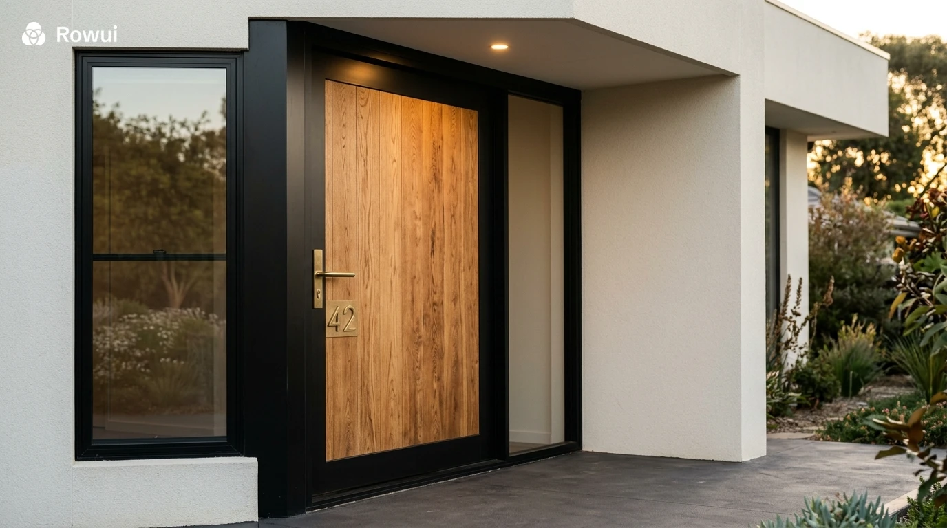
Black aluminum window frames are the most widely used choice in contemporary homes because they create crisp definition against almost any wall color, reinforce the geometric nature of modern architecture, and photograph exceptionally well. On a white or light facade they read as precise graphic lines. On a dark facade they dissolve into the wall, making the glass appear almost frameless. Warm aluminum finishes in bronze, copper, or champagne are gaining popularity as alternatives that bring warmth and material interest without sacrificing the clean lines of modern detailing.
Front Doors
The front door is the single most expressive element on a modern facade and deserves careful thought. Pivot doors in natural timber or dark stained panels introduce warmth and craftsmanship to an otherwise restrained composition. A bold colored door, deep red, cobalt blue, forest green, or even soft blush pink, can animate a more neutral facade with personality and a clear sense of welcome. The door color should relate back to the overall palette rather than compete with it. On a charcoal facade, a warm timber door creates harmony. On a white facade, a deep green door creates a botanical freshness that feels grounded and considered.
Hardware and Fixtures
Door handles, house numbers, exterior light fixtures, and letterboxes are small in scale but significant in character. Matte black hardware on a dark facade maintains tonal consistency. Brushed brass or aged bronze on a lighter or warmer facade introduces a material warmth that elevates the overall sense of quality. Mixing hardware finishes across a single facade, such as chrome handles with brass light fixtures and painted steel railings, creates a fractured, unconsidered impression that undermines even the best color palette.
Color and Light: Understanding How Your Facade Will Look at Different Times of Day
Paint swatches are notoriously misleading because they are assessed under artificial interior lighting conditions that bear little resemblance to the way a full facade looks in direct sun, open shade, or under cloudy skies. Before committing to any exterior color, it is essential to observe large test patches on your actual walls under the light conditions you live with daily.
A warm gray that looks sophisticated under overcast northern light can look flat and washed out in bright Mediterranean sun. A terracotta that looks rich and grounded in afternoon shade can appear almost orange under direct midday sun. Southern hemisphere homes, which receive the majority of their sunlight from the north, will read wall colors very differently from northern hemisphere homes where facades are often in shadow for much of the day.
Evening is also worth considering. As natural light fades, exterior lighting takes over. Warm uplighting on textured rendered walls emphasizes surface quality and creates shadows that add depth to the facade after dark. Downlights under eaves wash light across the entry and driveway in ways that can make even a modest home feel architecturally considered and genuinely welcoming.
Common Mistakes to Avoid With Modern Exterior Color
Even well-intentioned homeowners fall into predictable traps when choosing exterior colors. Being aware of these pitfalls in advance saves significant time, money, and frustration.
Choosing color from a small swatch without testing at full scale is the most common mistake. A 10 centimeter swatch cannot tell you how a color will behave across a 15 meter wall. Always paint large test patches, at least 1 meter square, in the actual location and observe them across several days and lighting conditions before ordering paint or cladding in quantity.
Following trends without considering context produces exteriors that feel fashionable for two years and dated for twenty. The most enduring modern exterior palettes tend to be rooted in the materials and landscape of the place where the house sits. A deep charcoal render might look spectacular on a bush block property and feel entirely out of place on a beachside street where the predominant palette is bleached timber and white render.
Ignoring the fixed elements, meaning the roof, driveway, and boundary fencing, is another frequent error. These elements contribute significantly to the overall color composition of the facade but are often not changeable at the time of a repaint. Always work your new color choice back against these fixed tones to ensure the overall picture holds together.
Working With an Architect or Color Consultant
For significant renovation or new build projects, engaging a professional to guide your exterior color decisions is one of the most cost-effective design investments you can make. An architect or experienced color consultant brings an understanding of proportion, material relationships, and contextual sensitivity that is genuinely difficult to replicate through independent research and paint sample comparisons alone.
A good consultant will assess your home's form, the quality and direction of natural light, the existing fixed finishes, and the character of the surrounding streetscape before recommending a palette. They will also help you understand the difference between a color that photographs well on Instagram and a color that will live comfortably as the backdrop to your daily life for the next decade or more.
If budget does not allow for a full consultation, many paint companies and architecture firms now offer online color advisory services where you submit photographs of your home and receive a curated palette recommendation. This is a meaningful step up from choosing colors in isolation and is worth exploring before making any final decisions.
Conclusion
Exterior color is not decoration applied to architecture. It is architecture. The right palette amplifies the strengths of your home's form, connects the building to its landscape, and creates an experience of arrival that sets the tone for everything inside. Modern homes offer enormous creative latitude in how color is used, from restrained monochromatic compositions in deep charcoal or warm white, to bolder explorations in terracotta, sage green, or matte black. What matters most is that every choice is made with intention, tested in context, and considered in relationship to the materials, light, and landscape surrounding the house. Take the time to look carefully, test generously, and choose confidently. The results will reward you every time you pull into your driveway.