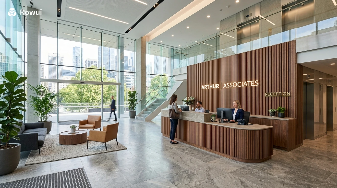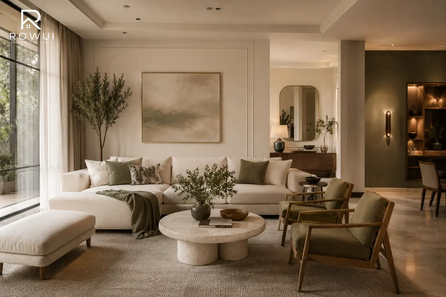
There is a widespread belief that a beautiful, polished home requires a serious budget. Architects and interior designers know otherwise. The difference between a home that looks thoughtfully curated and one that feels unfinished rarely comes down to money spent. It comes down to decisions made. Proportion, colour, texture, light and detail are the real currencies of good design, and most of them are surprisingly affordable. Whether you own a modest terrace house, a suburban semi or a compact apartment, these twenty practical strategies will help your home look and feel far more considered, refined and expensive than its price tag suggests.
Start With What People See First
First impressions in architecture are formed within seconds. The entrance sequence, from the street to your front door, sets the tone for everything inside. Ignoring the exterior while obsessing over interiors is one of the most common design mistakes homeowners make.
1. Paint Your Front Door a Considered Colour
A front door is the face of your home. Replacing it entirely costs money, but repainting it costs very little and delivers an outsized visual return. Deep, confident colours work exceptionally well. Think forest green, navy blue, charcoal, burgundy or a warm black. These shades communicate permanence and intention. Avoid faded pastels or colours that clash with your brickwork or render. If your home has warm red brick, a dark olive or deep teal front door creates a sophisticated contrast. For white or grey render, a glossy black or slate blue door looks immediately expensive. Use exterior eggshell or gloss paint for durability and finish quality.
2. Upgrade Your Door Hardware
Nothing undermines a beautifully painted door like a plastic letterbox and a cheap chrome handle. Swap out your door furniture for solid brass, brushed nickel or matte black equivalents. A good quality door knocker, a handle with real weight to it and a properly proportioned house number in a clean typeface signal care and quality to any visitor. These items are inexpensive individually and collectively transform the personality of an entrance. Match the finish across all elements for a cohesive result.
3. Frame the Entrance With Planting
Symmetry reads as formality and formality reads as quality. Placing a pair of matching planters either side of your front door instantly creates architectural gravitas. Box balls, bay trees clipped into lollipop standards or olive trees in simple terracotta or zinc planters work across most house styles. Keep the planting contained, geometric and well maintained. A single overgrown shrub looks neglected. Two clipped topiary spheres in matching pots look like a Georgian townhouse. The difference is discipline, not expense.
The Power of Paint Indoors
Paint is the single most cost effective design tool available to a homeowner. Used well, it transforms proportion, mood, light levels and the perceived quality of every surface in a room.
4. Choose a Considered Colour Palette and Commit to It
Expensive looking homes share a quality that is hard to name but easy to recognise: coherence. Every room feels like it belongs to the same story. Achieve this by selecting two or three complementary colours and using them consistently across your home. A warm off white like Farrow and Ball's Pointing or Little Greene's Shirting on walls, paired with a deeper tone on joinery and a natural material for floors, creates a palette that feels deliberate and refined. Avoid the trap of a different accent colour in every room. Restraint is the hallmark of good taste.
5. Paint Your Ceiling a Shade Darker Than You Think
Most people default to brilliant white ceilings regardless of wall colour, which creates a disconnected, clinical effect. Painting the ceiling the same colour as the walls, or one shade lighter, wraps the room in a single tone and makes it feel like a designed space rather than a painted box. In a living room with deep sage green walls, a sage ceiling pulls the room together and makes the space feel cocooning and intentional. In a hallway, a dark ceiling above pale walls creates drama and height perception simultaneously.
6. Paint Your Interior Doors and Skirtings
White plastic looking skirtings and flat hollow core doors are the visual equivalent of wearing a beautiful suit with trainers. Painting your skirting boards, architraves and interior doors in a deeper, richer tone than your walls immediately suggests quality joinery. A charcoal grey or dark green on the woodwork against an off white wall is one of the most effective and least expensive upgrades you can make. It creates the impression of depth, craftsmanship and considered layering that characterises genuinely expensive interiors.
Lighting Transforms Everything
Lighting is where architecture and atmosphere meet. Poor lighting exposes every flaw in a room. Good lighting conceals imperfection and amplifies beauty. Most homes are dramatically over lit with harsh overhead lights and dramatically under lit in the places that matter.
7. Layer Your Light Sources
A single ceiling pendant or a row of recessed downlights does not constitute a lighting scheme. Expensive looking rooms use at least three layers of light: ambient light for general illumination, task light for functional areas and accent light for atmosphere. Table lamps, floor lamps, under cabinet lighting in kitchens and picture lights above artwork all contribute to a layered effect that feels warm, residential and curated. Aim for pools of light at human eye level rather than a uniform wash from above.
8. Replace Cheap Light Fittings
The light fitting in a room functions like jewellery on an outfit. A thoughtfully chosen pendant or wall sconce elevates the perceived value of everything around it. You do not need to spend a fortune. Rattan pendants, ceramic table lamps, simple iron wall lights and glass globe pendants are all widely available at modest prices and photograph and feel far more expensive than their cost. Replace any fitting that has a plastic shade, a visible bulb holder or a generic builder grade aesthetic. It will immediately improve the room.
9. Switch to Warm White Bulbs Everywhere
Bulb colour temperature has an enormous effect on how a home feels. Cool white or daylight bulbs, typically 5000K to 6500K, create a clinical, commercial atmosphere. Warm white bulbs at 2700K to 3000K replicate the quality of candlelight and incandescent glow that the human eye finds instinctively welcoming and beautiful. Change every bulb in your home to a consistent warm white and the effect is immediate. Rooms feel softer, materials look richer and colours become more accurate and flattering.
Proportion, Scale and Layout
Architecture is fundamentally the management of proportion. When things are the right size in relation to each other and to the people using them, a room feels effortless. When proportions are wrong, something feels off even if you cannot identify exactly why.
10. Hang Curtains From Ceiling to Floor
This single change is one of the most dramatic and inexpensive improvements you can make to any room. Most homeowners hang curtains at window height, which truncates the wall and shrinks the apparent ceiling height. Hanging curtains as close to the ceiling as possible and letting them fall to the floor makes windows look dramatically taller, rooms feel more generous and the whole space reads as architecturally confident. Use simple linen or cotton curtains in a tone close to your wall colour for maximum effect. Avoid busy patterns if the goal is an elevated, restrained aesthetic.
11. Choose One Large Piece of Art Rather Than a Gallery of Small Pieces
A single oversized artwork commands a wall with authority. A cluster of small, mismatched frames feels tentative and busy. If original large scale artwork is beyond your budget, consider a large format photographic print, a simple canvas painted in a single bold colour or a large architectural drawing. Proportion matters more than price. A 1.2 metre wide print hung at the correct height, with the centre of the image at approximately 145 to 150 centimetres from the floor, looks confident and intentional. Surround it with breathing space rather than crowding it with other objects.
12. Edit Ruthlessly
Expensive homes rarely look cluttered. They feel calm, spacious and deliberate. Walk through each room and remove anything that does not have a clear functional or aesthetic purpose. Store it, donate it or sell it. The items you keep will immediately look more valuable in the space they have gained. Surfaces should have fewer, better objects. Shelves should have breathing room between books and decorative items. Entryways should be clear of accumulated detritus. Editing is not minimalism for its own sake; it is the architectural principle of letting each element breathe.
Materials, Texture and Finish
The tactile quality of a home, what surfaces feel like underhand and underfoot, contributes enormously to how expensive it seems. The goal is not to use luxury materials everywhere but to use honest, quality materials where they count and avoid cheap finishes that undermine everything around them.
13. Replace Laminate Handles With Real Metal
Kitchen cabinets that have integrated push to open mechanisms or plastic handles often look dated regardless of the cabinet colour. Replacing handles with simple solid metal bar pulls in brushed brass, matte black or satin nickel costs very little per unit and transforms the entire kitchen aesthetic. The same principle applies to bathroom vanity units. The handle is a point of daily physical contact, and the weight, texture and finish of a quality metal handle communicates craftsmanship in a way that a plastic equivalent never can.
14. Introduce Natural Materials at Every Opportunity
Timber, stone, linen, ceramic and leather are materials that age beautifully and read as inherently valuable regardless of their actual cost. A timber chopping block on a kitchen counter, a jute rug under a dining table, a linen throw on a sofa, a marble effect ceramic tile used as a splashback, a terracotta plant pot on a windowsill: each of these introduces natural material quality into your home at minimal expense. Layer these materials and avoid rooms that consist entirely of man made finishes. The contrast between a smooth painted wall and a raw timber shelf, for example, creates a richness that feels designed rather than assembled.
15. Tile to the Ceiling in Bathrooms
Half height tiling in a bathroom immediately signals a budget decision. Full height tiling, from floor to ceiling, looks architectural and deliberate regardless of which tile you choose. It also eliminates the awkward painted zone above the tiles that gets damp and discolours over time. Choose a simple large format tile, ideally 600 by 600 millimetres or larger, in a warm neutral such as a limestone effect, an off white ceramic or a soft grey. Large format tiles with minimal grout joints look more expensive than small tiles with lots of grout lines because they feel considered and contemporary.
Windows, Views and the Outside Connection
Windows are not simply openings for light. They are frames for views, mediators of weather and season and one of the most powerful architectural elements in any home. How you treat your windows and the relationship your home has with its garden or outdoor space significantly affects its perceived quality.
16. Keep Window Treatments Simple and Well Fitted
Ill fitting, overly busy or drooping window treatments are one of the most common signs of a home that has not been properly considered. Roller blinds in a clean linen fabric, roman blinds that sit neatly inside the window reveal, or the full length curtains discussed earlier are all inexpensive and look far better than layered net curtains, heavily patterned drapes or plastic venetian blinds. The key word is fitted. A curtain that puddles sloppily on the floor looks slovenly. A blind that does not fill its reveal properly looks cheap. Measure twice, order once and fit precisely.
17. Create a View Where One Does Not Exist
Not every window looks onto an inspiring garden or a beautiful street. If your window faces a fence, a wall or an unremarkable view, create visual interest inside rather than looking outside. A deep windowsill furnished with a simple ceramic pot, a trailing plant or a single sculptural object draws the eye to the window without relying on what lies beyond it. Alternatively, consider adding a window box on the exterior to transform the view from inside looking out. This costs almost nothing and adds significant charm to both the interior experience and the street elevation.
The Kitchen and Bathroom Without Full Renovation
These are the two rooms that most dramatically affect both the livability and resale value of a home. They are also the two rooms most people assume require complete renovation to improve. They do not.
18. Refresh Kitchen Cabinet Fronts or Paint Existing Ones
Replacing cabinet doors is significantly cheaper than a full kitchen refit and delivers most of the visual impact. If your carcasses are in good condition, fitting new flat panel shaker style doors in a painted finish transforms the kitchen entirely. Alternatively, if the existing doors are solid wood or medium density fibreboard, painting them in a contemporary colour, with proper preparation, primer and a specialist cabinet paint in satin finish, creates a result that is indistinguishable from a new kitchen at a fraction of the cost. Pair this with the new metal handles discussed earlier and the effect is remarkable.
19. Replace Taps and Showerheads
Taps and showerheads age quickly and are often the most visually dated element in a bathroom or kitchen. Replacing them is a DIY task in most cases and costs far less than any structural change. A wall mounted basin tap in brushed brass, a rainfall showerhead in matte black or a simple bridge tap in chrome with ceramic lever handles all communicate a level of quality that upgrades the entire room. Ensure your chosen finish is consistent with other metal elements in the space, whether that is door handles, towel rails or light fittings.
The Finishing Layer
The difference between a home that feels finished and one that feels perpetually in progress is usually found in the smallest details. These are the elements that cost almost nothing but require the most attention and intention.
20. Add Architectural Mouldings or Picture Rails
Period homes often have cornicing, dado rails, picture rails and ceiling roses that give them an immediate sense of craft and age. Modern homes rarely include these elements because they cost money to install during construction. Adding them retrospectively is easier and cheaper than most people expect. Lightweight polyurethane or plaster effect cornicing can be fitted by a competent DIY enthusiast over a weekend. A simple picture rail running around a room at the correct historical height of around 30 to 45 centimetres below the ceiling adds immediate architectural character. Paint all mouldings the same colour as the ceiling or in a contrasting tone for a more graphic, contemporary effect. This one addition, more than almost any other on this list, makes a room feel like it was designed rather than decorated.
Bringing It All Together
What separates a home that looks expensive from one that merely costs a lot is the quality of attention paid to it. Every strategy on this list shares a common principle: intention. When choices are made deliberately, when proportions are considered, when finishes are consistent and when clutter is eliminated, a home begins to communicate confidence and care regardless of its market value.
None of these twenty improvements requires significant financial investment. Several of them require nothing more than a tin of paint, a screwdriver and a willingness to edit. What they all require is thought. And that, ultimately, is what good architecture has always been about. Not the budget, but the decision making behind it. Start with one room, apply these principles with patience, and the transformation will be both visible and genuinely satisfying.