Most people assume that a cramped room is simply a permanent problem, something to live with until a renovation budget finally arrives or a bigger home becomes possible. But the truth is that the feeling of space has very little to do with actual square footage. It has everything to do with how light moves through a room, how the eye travels across surfaces, how furniture sits in relation to walls, and how colour, scale and proportion work together. Architects and interior designers manipulate these variables every day to make modest rooms feel generous, calm and surprisingly open. The good news is that most of these techniques require nothing more than thoughtful decisions, not a sledgehammer.
Understanding Why Small Rooms Feel Small
Before reaching for a paint brush or rearranging furniture, it helps to understand what actually makes a room feel tight. A space feels small when the eye has nowhere to travel. Visual clutter, heavy furniture pushed against every wall, low ceilings with dark colours overhead, and poor lighting that creates shadows in corners all compress the perceived boundaries of a room. Contrast this with a room where the floor stretches visibly from one end to the other, where light reaches into corners, and where the eye is gently guided toward a focal point rather than stopped abruptly by a bulky sofa. The physical dimensions have not changed. The experience has.
Architects refer to this as perceived spatial quality, and it is shaped by three fundamental forces: light, line and layer. When these three work together in a small room, the result feels intentional and spacious. When they work against each other, even a generously sized room can feel suffocating. Every tip in this article connects back to one or more of these forces.
Use Colour to Push Walls Outward
Colour is one of the most accessible tools available to a homeowner and one of the most misunderstood. The common advice is simply to paint everything white, but white alone is not always the answer and can sometimes make a room feel cold, flat and clinical rather than open. The more nuanced approach involves understanding how warm and cool tones, light reflectance values and tonal continuity affect the way a room reads.
Light Reflectance and Tonal Continuity
Paint colours are given a light reflectance value, or LRV, which measures how much light a colour bounces back into a room. Pure white typically sits at around 85 to 90, while a mid-tone grey might sit at 40. In a small room with limited natural light, choosing colours with an LRV above 70 will make the walls feel less dense and more recessive. Soft whites, warm creams, pale stone tones and very light sage greens all perform well in this range.
More importantly, tonal continuity, meaning using the same colour or very similar tones across walls, ceiling, trim and even built-in furniture, removes the visual interruptions that define where a room ends. When skirting boards, door frames and walls are all the same soft shade, the eye does not register edges as boundaries. The room simply feels larger because the boundaries have been visually softened. This technique, sometimes called a tone-on-tone approach, is used extensively in Scandinavian and contemporary minimalist interiors for exactly this reason.
When to Use Darker Colours
Counterintuitively, a deep, saturated colour applied to all four walls and the ceiling of a small room can sometimes make it feel more enveloping and dramatic rather than tight. This works when the goal is atmosphere rather than openness, and when furniture is kept low, minimal and light in tone. A small study painted in a deep forest green or inky navy with brass hardware and warm lighting can feel like a jewellery box rather than a box. This is a deliberate design choice, and it works precisely because the room stops trying to pretend it is larger than it is.
Flooring Lines and Visual Length
The floor is the largest single surface in any room, and the direction and pattern of flooring material has a dramatic effect on how a room reads spatially. In a narrow room, laying rectangular timber boards or tiles along the longest axis draws the eye from one end to the other, making the room feel longer and more generous. Laying those same boards across the width of the room creates visual stops that make the space feel shorter and tighter.
Large format tiles, typically 600mm by 600mm or bigger, reduce the number of grout lines visible across a floor, which reduces visual noise and makes a floor feel more expansive. In contrast, small mosaic tiles or heavily patterned floors introduce constant visual interruption that shortens perceived depth. Continuing the same flooring material from one room into the next, particularly from a hallway into a living area, also removes boundaries and extends the visual territory of both spaces without removing a single wall.
If a full floor replacement is not possible, large rugs placed under the main furniture grouping can define a zone within the room while allowing floor to remain visible around the edges. A rug that is too small, particularly one that only sits under the coffee table, islands furniture visually and makes both the rug and the room feel smaller.
Furniture Scale, Placement and Negative Space
One of the most common mistakes in small rooms is filling every available corner with furniture. The instinct comes from a desire to make a room functional and comfortable, but the result is a room that feels overstuffed and smaller than it is. The architectural principle at work here is negative space: the empty areas around and between objects are just as important as the objects themselves. Negative space gives the eye a place to rest and allows the boundaries of the room to remain legible.
Choosing the Right Scale
Furniture in a small room should be chosen with careful attention to scale, but this does not always mean choosing smaller pieces. A single large sofa that suits the proportion of the room and is paired with one or two slender side pieces will almost always feel better than three or four mismatched small pieces competing for attention. The key is choosing fewer pieces of appropriate scale rather than many small pieces that create visual noise.
Furniture with exposed legs, whether a sofa, armchair or sideboard, allows the floor to remain visible underneath, which extends the perceived floor area and lightens the visual weight of the piece. A sofa that sits directly on the floor with a full skirt creates a dense block that visually divides the room. Raised on legs, the same sofa feels lighter and the room beneath it contributes to the sense of open floor space.
Placement Away from Walls
Another counterintuitive move is to pull furniture slightly away from walls rather than pushing it flush against them. Leaving even 100 to 150mm of space between the back of a sofa and the wall creates a sense that the room extends behind the furniture. This technique is used in showrooms and well-designed interiors precisely because it avoids the "waiting room" effect of furniture lined up against every surface.
Mirrors, Glass and Reflective Surfaces
Mirrors are perhaps the single most effective non-structural tool for expanding the perceived size of a room. A well-placed mirror does not just reflect the room back at you: it creates the visual impression of a second space beyond the wall, effectively doubling the perceived depth. The placement matters enormously. A mirror positioned opposite a window reflects natural light back into the room and also reflects the view outside, connecting the interior to the exterior and making the room feel less enclosed.
Large format mirrors, ideally running from near the floor to the ceiling or spanning a significant width of wall, are more effective than small decorative mirrors scattered around a room. A single full-height mirror panel on one wall can transform a narrow bedroom or hallway into a space that reads as twice its actual width. Leaning a large mirror against a wall, rather than hanging it at eye level, draws the eye downward and reinforces the sense of floor depth.
Glass-fronted cabinetry, glass-topped tables and furniture with chrome or polished metal legs all contribute reflectivity to a room without the obvious visual device of a mirror. These surfaces catch and bounce light, reducing the density of the room and keeping it feeling lighter and more open. A glass dining table in a small dining room, for example, allows the floor pattern to remain visible through the table surface, which is impossible with a solid timber top.
Lighting Strategy for Spatial Expansion
Dark corners are the enemy of perceived space. When a room has shadows in its corners and edges, the boundaries feel closer and more definitive. Strategic lighting that illuminates the perimeter of a room, pushing light toward the edges rather than concentrating it in the centre, dissolves those boundaries and makes the room feel more expansive.
Layered Lighting
Good lighting in a small room is not about a single bright overhead fixture. It is about layering ambient light, task light and accent light so that every part of the room receives some illumination. Wall-mounted uplighters or picture lights that wash light up a wall draw the eye upward and make ceilings feel higher. Floor lamps positioned in corners eliminate shadow pockets. Under-cabinet lighting in a kitchen or shelving unit pushes light into recesses that would otherwise appear dark and dense.
Recessed ceiling lights placed closer to walls rather than clustered in the centre of the ceiling create a wall-washing effect that makes both the wall and the ceiling feel more open. This is a simple repositioning that electricians can achieve without structural work and that transforms how a room reads after dark.
Natural Light Maximisation
If windows cannot be enlarged, their placement and treatment can still be optimised. Hanging curtains above the window frame and extending the curtain rod well beyond the width of the window makes the window appear larger and allows maximum light to enter when curtains are open. A curtain hung just above the window frame and only as wide as the glass itself blocks side light and makes the window look smaller than it is.
Sheer curtains that allow diffused daylight through, even when closed, maintain the connection to the outside and keep the room feeling bright throughout the day. Replacing heavy, room-darkening blinds with woven shades or linen sheers in a small room can make a noticeable difference to daytime brightness without sacrificing privacy.
Vertical Lines and Ceiling Height
Rooms with low ceilings feel compressed, and while raising a ceiling physically is indeed a structural job, the visual impression of ceiling height can be manipulated with several simpler techniques. Vertical elements draw the eye upward and create the illusion of greater height. Floor-to-ceiling bookshelves or cabinetry, vertical tongue-and-groove panelling, tall slender windows and vertically oriented artwork all encourage the eye to travel up rather than across.
Painting the ceiling a lighter tone than the walls, or continuing the wall colour onto the ceiling while keeping the trim crisp and white, both push the ceiling plane upward visually. Hanging pendant lights or chandeliers lower than the standard position also draws attention to the volume of space above them, making the ceiling feel higher by contrast.
Curtains hung at ceiling height and falling to the floor are one of the most elegant ways to add perceived height to a room. Even in a room with a standard 2.4 metre ceiling, full-height curtains create a dramatic sense of verticality that makes the room feel proportionally grander.
Built-In Storage and Clutter Reduction
Clutter is the fastest way to destroy any spatial improvement made through colour, light or furniture placement. A room filled with visible storage, objects sitting on surfaces and items stacked on the floor will always feel smaller than its dimensions because the eye has too much to process and nowhere to rest. Built-in storage is the architectural solution to this problem: it takes the storage off the floor and integrates it into the fabric of the room so that it reads as wall rather than furniture.
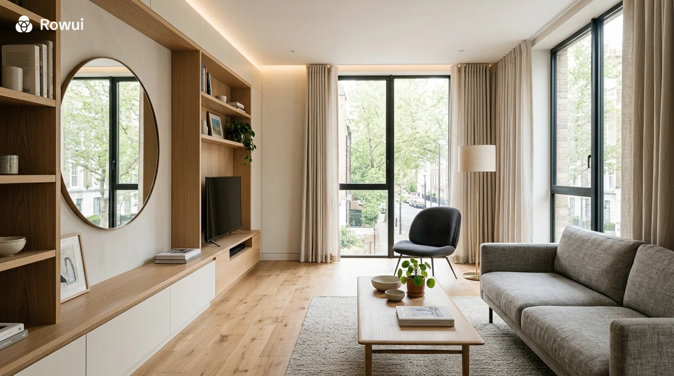
A built-in wardrobe flush with surrounding walls and painted to match them effectively disappears, whereas a freestanding wardrobe of the same volume creates a dense block that reduces floor area and visual space. Floor-to-ceiling built-ins in a living room, with closed lower cabinets for concealed storage and open upper shelving for display, give a room the feeling of a custom-designed interior rather than a generic space trying to contain too much stuff.
Under-bed storage, window seats with internal drawers and hallway benches with hidden compartments all reduce the need for additional furniture that would otherwise crowd a small space. The principle is simple: every item that has a hidden home frees visible surface area, and visible surface area is what makes a room feel spacious.
Architectural Details That Trick the Eye
Several architectural details, achievable without structural work, consistently improve the spatial quality of small rooms. Removing door frames and architraves and replacing them with flush door reveals creates a cleaner, more continuous wall surface that reads as less interrupted. Choosing internal doors that match the wall colour or are painted the same tone makes them recede visually rather than standing out as separate elements breaking up the surface.
Removing ceiling coving or replacing ornate cornices with a simple square shadow gap, a narrow recessed line where wall meets ceiling, gives a room a more contemporary and expanded feeling. Conversely, adding coving to a room with a rough or awkward ceiling-to-wall junction tidies the transition and makes the room feel more finished and proportionally correct.
Low-profile skirting boards in smaller rooms, or skirting painted to match the wall so it visually disappears, keeps the floor-to-wall transition clean and reduces the number of colour breaks the eye has to process. Every colour break is a perceived boundary, and fewer boundaries mean a room that reads as more continuous and therefore larger.
Conclusion
Making a small room feel bigger is not about deception. It is about understanding how the human eye and mind experience space, and then applying that understanding with considered, deliberate choices. Light that reaches corners, colours that recede rather than crowd, furniture that shows floor beneath it, mirrors that suggest depth, and storage that keeps surfaces clear are all tools that any homeowner can apply without a single structural change.
The most important takeaway is this: every decision in a small room either adds to or subtracts from the sense of space. A curtain hung too low, a rug too small, a pendant light too high, a cabinet too dark, all of these are quiet decisions that accumulate into the overall feeling of a room. Start with light, then address line and then layer. Make each decision deliberately, and a room that once felt like a compromise will begin to feel like a considered, genuinely comfortable space worth living in.